Usability Test of the Library of Congress Website
My thinking for the usability test was that it should be geared toward average users who may not find much reason to go to the Library of Congress website, but may do so once they realize how much is available to them on it. I also made it a point to structure the usability test so that it was increasingly more complex, but that all of the information I asked them to find on the website was fairly straightforward, and things they’d actually have to look up for themselves or someone else. They had to find the following information in this order: (1) hours of operation (2) ask a librarian (3) a trending topic (4) lesson plans for teachers and (5) a map of the original 13 colonies. In terms of metrics by which to measure their experience with the website usability, I decide to work with mostly three different metrics: the length of time it took them to complete tasks, a subjective rating of the usability on a 1 to 5 scale, and other themes & trends I might be able to assemble from qualitative data, my observations of their web paths along with their commentary, feedback, and how they talked aloud during the process. A final consideration I built in to the test, was to have a variety of ages attempting to use the LoC website, ranging from 16 years-old to 49 years-old. The participants themselves and their ratings can be found in the chart below, along with their ages and occupations.
All of the participants were able to find the information indicated in the test without guidance. However, many of them found it surprisingly difficult to find the hours of operation and the trending topics pieces of the usability test. Interestingly, each and every participant immediately began searching through the navigational toolbar for the pertinent information before scrolling further down the home page to view all the material there. This led to quite a bit of confusion attempting to find, and some issue understanding what was meant, by find a trending topic. Two of the participants ran into trouble when trying to find a map of the original colonies because they did not realize that they were searching a website page, which was selected in the dropdown menu by default, rather than 'search everything' which is the default on the home page. So rather than looking for maps, they were actually looking for lesson plans about maps. Three of the participants expressed some frustration or confusion at the interface. Two of them reported incredibly easy navigation through the various pages of the website.
| Participant | Age | Occupation | Time to Complete | Usability Rating |
|---|---|---|---|---|
| P1 | 24 | Graphic Designer | 5:29 | 1 |
| P2 | 32 | Communications | 4:55 | 3 |
| P3 | 16 | High School Student | 3:40 | 1.5 |
| P4 | 37 | Artist | 8:45 | 3.5 |
| P5 | 55 | Teacher | 8:45 | 4 |
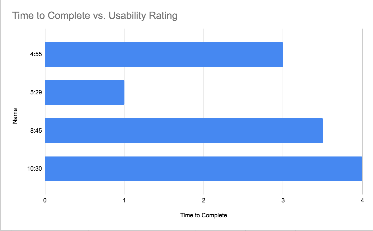
When prompted to reflect on their experience navigating the website, P1 had the most positive feedback. They said the website had an attractive design and was quite intuitive to use. P5 had the most negative response, at first joking, 'It really sucked because my teacher sucked!', and then explaining that because the website is so vast and rich with so many resources, it's challenging to search easily through all that information. I think she was also under the impression that the test was more on her abilities as a locator of information rather than the usability of the website, which perhaps I should have made clearer from the start of the test. I think it was also interesting to reflect upon the fact that, although generally indicative of their rating, it was not always true that the longer it took someone to find the information in question, the more difficult they rated using the website. In particular, the graphic designer, P1, had the best rating of the website's usability, yet found the information third quickest. You can see a chart comparing the time to complete and usability rating below.
I think in general, this website is very usable. Most of the challenge the participants expressed and experienced was due to the sheer volume of information accessible through the website through thousands of different pages. That being said, a few trends came out of these usability tests. Multiple participants expressed difficulty trying to find the hours of operation for the physical library, which you had to access through one of the navigation bars and was buried a few pages beyond that. The latter two participants were also thrown off by trying to find information about colonial maps after having just found the lesson plans page. Their instinct was to search with the toolbar on that page, without noticing that the search bar defaulted to searching only items within the lesson plans rather than across the entire website. This led quickly to frustration, and one can imagine how, if they were actual users, they might give up, or conclude that the information was not available online. Each of these fixes, based on only five participants' usability test results, would likely make this information easier to find, without drastically changing the layout or architecture of the web design.
With regards to this lab, I am glad that I had the experience of actually designing and implementing my own usability test. It was certainly an...imperfect process. But I can see how having a team of people to develop and implement more extensive and conclusive usability testing would provide incredibly important information to web designers and information architects. I also learned from this lab that I am incredibly grateful for CSS getting rid of the cumbersome need to stylize each and every new paragraph, heading, table, etc you may have to insert into a web document. Besdies this, it was interesting to see how people's backgrounds affected their experience of the website. Based on these five participants, it's true that the youngest of them found it easier to navigate the website. However, participant 2, despite finding the information faster than participant 1, felt as though the website was considerably more difficult to navigate. It could be possible that this is because her background in communications makes her need to find information faster to transfer it elsewhere; just as easily, participant 1 may have been so pleased with the website from a design standpoint, which could have influenced their rating. Regardless, I think this lab illuminates just how fine and meticulous a process it is to come up with a usability testing system that is well communicated, proctored, and records a variety of metrics wide enough to interpret the data into actionable steps, and enlists enough participants from diverse backgrounds, ages, occupations, and informational needs to have a truly conclusive report. If I were to go back and improve this process, I'd probably empahsize that the usability test does not reflect their ability as a user, nor does having trouble finding information necessarily reflect upon them. I'd also be discrete about recording the time limit, rather than openly putting the timer out on my phone. That adds an exam-like element to the usability test that I think could have affected the way they perceived the website.