Comparison of the Library of Congress Website
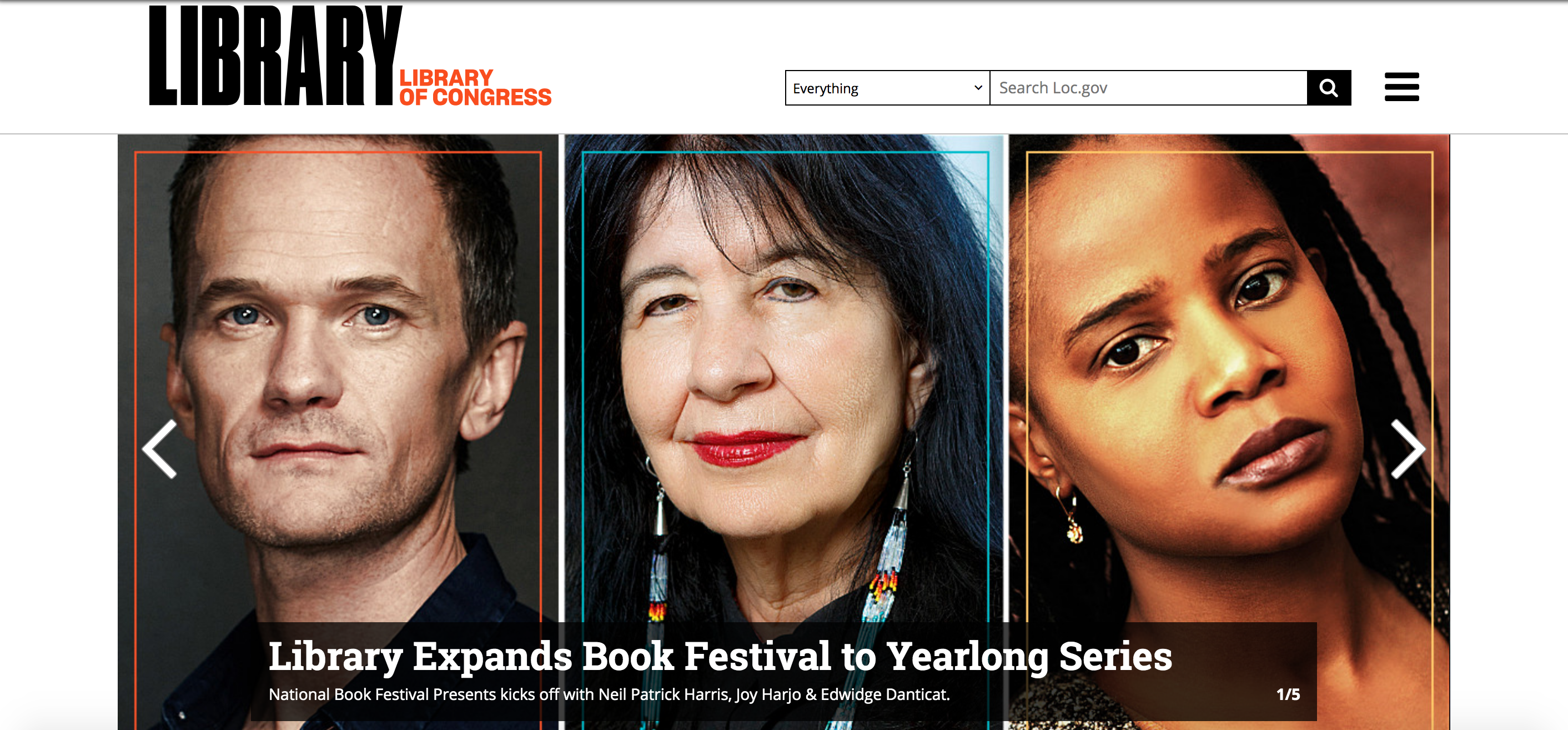
Library of Congress Sept. 9 2019 It’s been a while since I’ve gone to the Library of Congress’s home page, even though I use various bookmarked pages, like their virtual reference shelf, pretty regularly at work. What I’m struck by right away are three beautiful portraits of authors featured at the annual Book Festival. This is the first image mounted on a carousel of news, pages, and articles that are basically highlighted for marketing purposes. Beneath that carousel of featured stuff, you have the major navigational labels that divvy up the content of the site: Library Catalog, Digital Collections, Researchers, U.S. Copyright Office, Congress.gov, Law Library, and Teachers. Then you have trending searches, which definitely taps in to the user centered and increasingly social elements of Web 2.0, a section called “Your Library”, special exhibitions upcoming, and at the bottom, a gallery of “Free to Use and Reuse: Cars” with classic images. This site is actually alarmingly beautiful; it reminds me of something I’d see from a national magazine with the funds and attention to detail and presentation that comes from a whole marketing department. Having only worked at little libraries, that’s pretty jaw dropping.
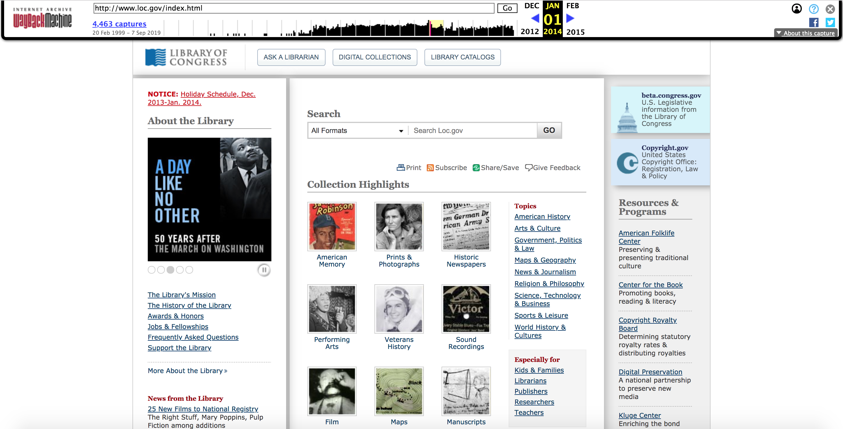
Library of Congress Mar. 1 2014 This looks like more of the library website I’m accustomed to. It’s not unmanageable to get around, but everything is certainly a lot more text heavy and it’s not nearly as central or visually appealing. Rather than have a few focal points from which to access material on the website, you see kind of clunky columns of text where the links and descriptions are all the same sized font descending either side of the web page. You still have the carousel of events and featured news; however, it’s a lot smaller, the images shuffle more quickly, and it’s a little bit more of an afterthought than the visually dramatic 2019 version. The major tabs at the top of the page in this iteration of the website are simply: Ask A Librarian, Digital Collections, and Library Catalogs. Pretty straightforward. These could help direct any user, from the academic researcher, to the tourist, to the regular library-goer. In general, everything is a lot boxier, and you can more easily see the “blocks” of content.
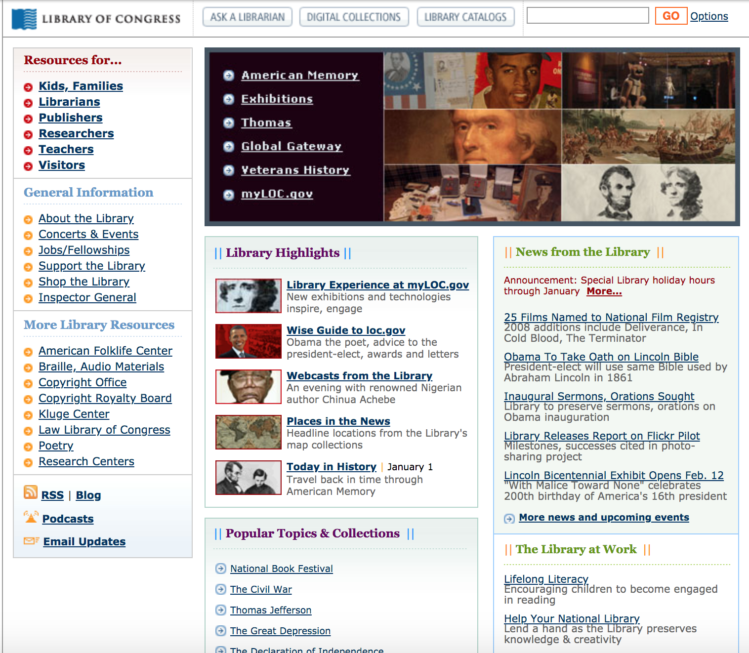
Library of Congress Mar. 3 2009 Incredibly, the entire home page of the website almost fits into one screenshot. That pretty well illustrates the sparsity of content and how condensed it all is. This time, you quite literally see the “boxes” of content that build the page, and there are very few headers or any featured content that demands more attention than other bits of the website. Visually, it looks like text (hello, html!). The same basic navigational tools that I saw on the 2014 page still exist, except I actually think this version has some more specificity about who rather than what than the 2014 page. You can seek resources not just by content but also by audience: kids, librarians, publishers, researchers, etc. This exercise definitely helps me appreciate how much more sophisticated web design and information architecture has become in such a short span of time. And it gives me a creepy glance forward, where the digital becomes physical through VR interfaces interlaced on seemingly every surface we touch…
The most significant changes to the Library of Congress’s website came between 2014 and 2019, although the entire span of ten years has seen a move away from a boxier, more text-heavy design into more aesthetically pleasing, user-focused, and social models of information architecture. To list out the more significant of these changes: more socially embedded content with user-generated tags, a magazine-like visually pleasing design with more visual emphasis in general, stronger hierarchies of information, where featured elements have a greater allocation of space on the page, fewer boxed in ladders of links and uniform looking text, and navigational tools with both content and audience in mind. Featuring user generated tags of LoC content illustrates recognition that so much of the Web 2.0 involves a social mode of information sharing rather than a more longitudinal author to reader model. Overall, I’m really impressed and powerfully impacted by how much the website for the LoC has changed specifically in the last five years for the better. It felt more like going through a dynamic multidirectional magazine spread than blocks of text. And this exercise really helped put into perspective for me how the field has shaped and motivated changes in websites and platforms I take for granted as a user.
- visually pleasing design
- navigational tools with both content and audience in mind
- hierarchies of information rather than text dumps
- socially embedded content with user-generated tags
- fewer boxed in ladders of links
- socially embedded content with user-generated tags
- hierarchies of information rather than text dumps
- visually pleasing design
- fewer boxed in ladders of links
- navigational tools with both content and audience in mind
| Year | Aesthetic Feel | Navigation Options | Content |
|---|---|---|---|
| 2009 | Text-heavy, blocky formatting, condensed, very limited images and formatting styles. | Simple links from only a few categories: access by audience, general info, or 'more' resources. | Kind of horizontally arranged, so that nothing gets priority or attention over other pieces. |
| 2014 | Slightly less boxy, more attractive to look at, a little more spread out. | Information seems more compartmentalized into categories, search function more obvious. | Collection Highlights centered as a priority on the home page, with About and Programs bookending the page. |
| 2019 | Magazine-like, incredibly attractive images, on carousel turnstyles to maximize available web space. | More hierarchically arranged, so that you have to scroll further to find more information. | There's a lot more information arranged here than earlier versions of the web page. |
Although learning these different HTML tags can be a little bit tedious, I'm actually finding these labs really gratifying. There's something very, seeing behind the curtain about working with the source code. In this lab in particular, I think learning to work through the W3Schools website and periodically taking tests along the way was a good way to learn this 'language' in digestible doses. Atom is also a much easier tool to use when editing this code, since it automatically highlights the different elements, making it a little bit easier to recognize when you've made a typo or messed up something that would be hard to see without the color coding. It's also interesting to note that it's not really plagiarism to copy and paste code from the W3Schools, so long as you format it to those purposes. I'm interested to learn more in the ethics of that as applied to other spaces and places, especially knowing that you can go to just about any website and take a look at the source code to see how someone built something the way they did. In the past, I've only looked at a page's source to find the RSS feed link. I'm looking forward to being able to graze through that information and identifying more and more about it the more that I learn.