Treemap of the Library of Congress Website
For this lab, I had to create a treemap of the Library of Congress website, simultaneously navigating through the website and evaluating the many levels of organization into levels. This proved to be a challenge just because of the sheer volume of information available on the Library of Congress website. Although the level 1 tier of information was rather obvious, since it was all featured on the navigational toolbar at the top of the home page, the level 2 and 3 information was less obvious depending on the page. In particular, the digital collections page and the library catalog page both contained a lot of links but not necessarily any headings as with a more straightforward informational page, like say, the 'About' section. I decided to include the different limiters in a search function as a secondary level of information, since these are navigational tools and further help users locate the actual information they're looking for, and without them, they'd probably end up moving on elsewhere to find the information. One thing that surprised me from completing this assignment was that there were actually more links and headings ascribed to types or formats of information in the Library of Congress's extensive collections as opposed to demographic of users searching, like teachers, students, researchers, etc. This points to an assumption that when people arrive at the Library of Congress website, they're there to find a specific kind of artifact, exhibit, or piece of information, seeing as how the website is set up to show those formats and collections in the searching functions more easily than by matching the audience to a presumed desired content. I also noticed that a great deal of the terms used already seemed incredibly vocabulary controlled. Perhaps this isn't suprising since the Library of Congress is so prestegious and their website more than likely has a whole team of people dedicated to designing and redesigning it--information architects and librarians among those responsible. If I were to go back in time, I think working with a small library would have made the task of ascribing levels of information to the website easier. Many small libraries have obvious HTML headings on each and every page, which make it easy to see how the information is chunked and where it lies on a hierarchy. That hierarchy tends to break down the more searchability function you add to a page, because the search delimiters aren't necessarily headings even if they do serve some of the same functions.
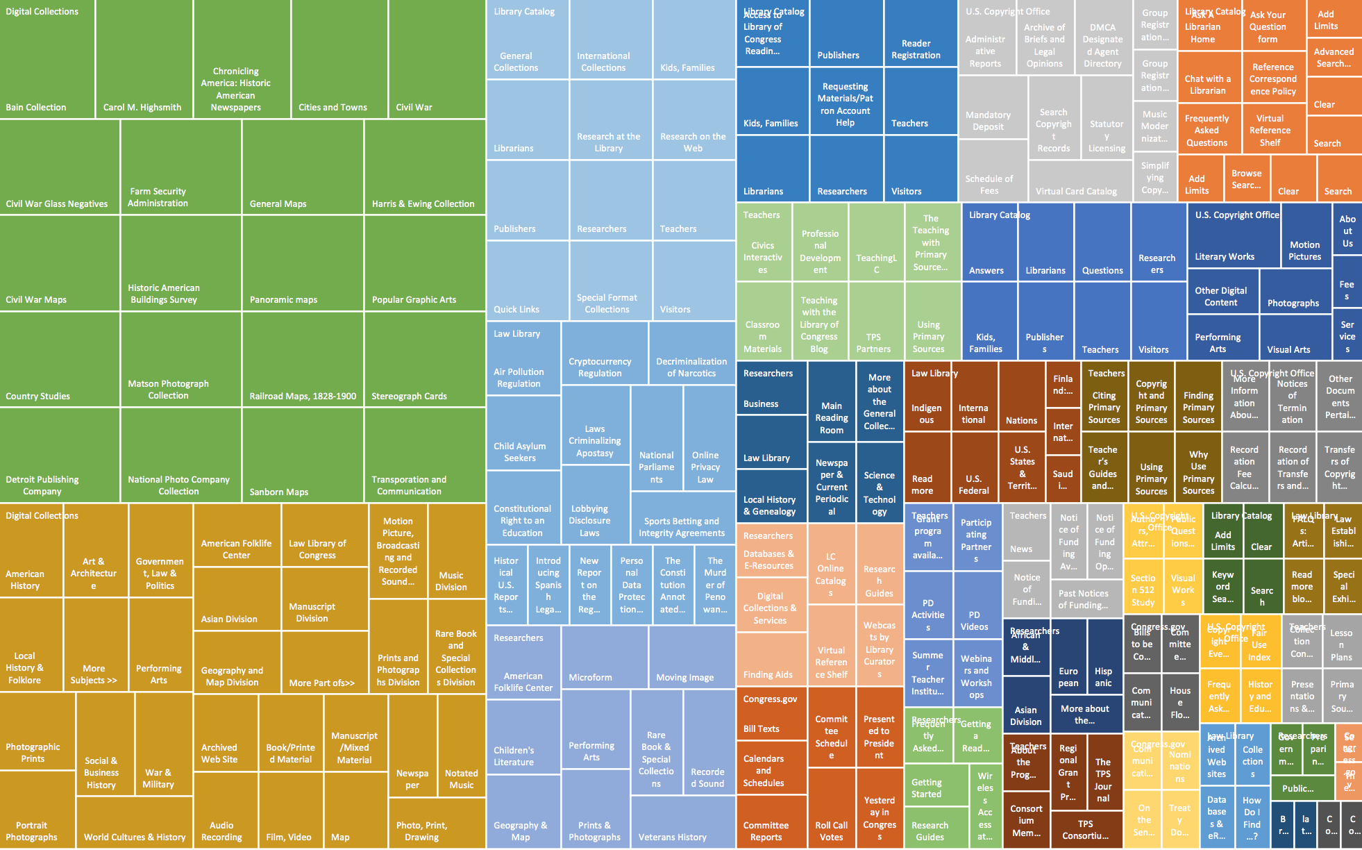
This lab showed how to understand your web design from beyond a descriptive, visual standpoint, by actually showing the weight of your secondary levels of information. You get more concrete data about the sorts of information pathways you highlight for your users and can critically evaluate from there whether or not those pathways are the most pertinent to your users. It also, on a very basic level, allows you to see the chunking of information with a color coded visual chart relative to other forms of chunked information on the same website. Again, this really helps web designers and information architects think about what forms of information are emphasized currently versus those they'd like to make more accessible to users. At the end of the day, there's always information that an organization--whether a library, business, or government agency--is going to want in front of its users more than other information. Treemapping helps show which pathways are currently 'highways' through the design of the website as opposed to, say, leisurely strolls through the back woods...