Comparison of Providence Community Library Website
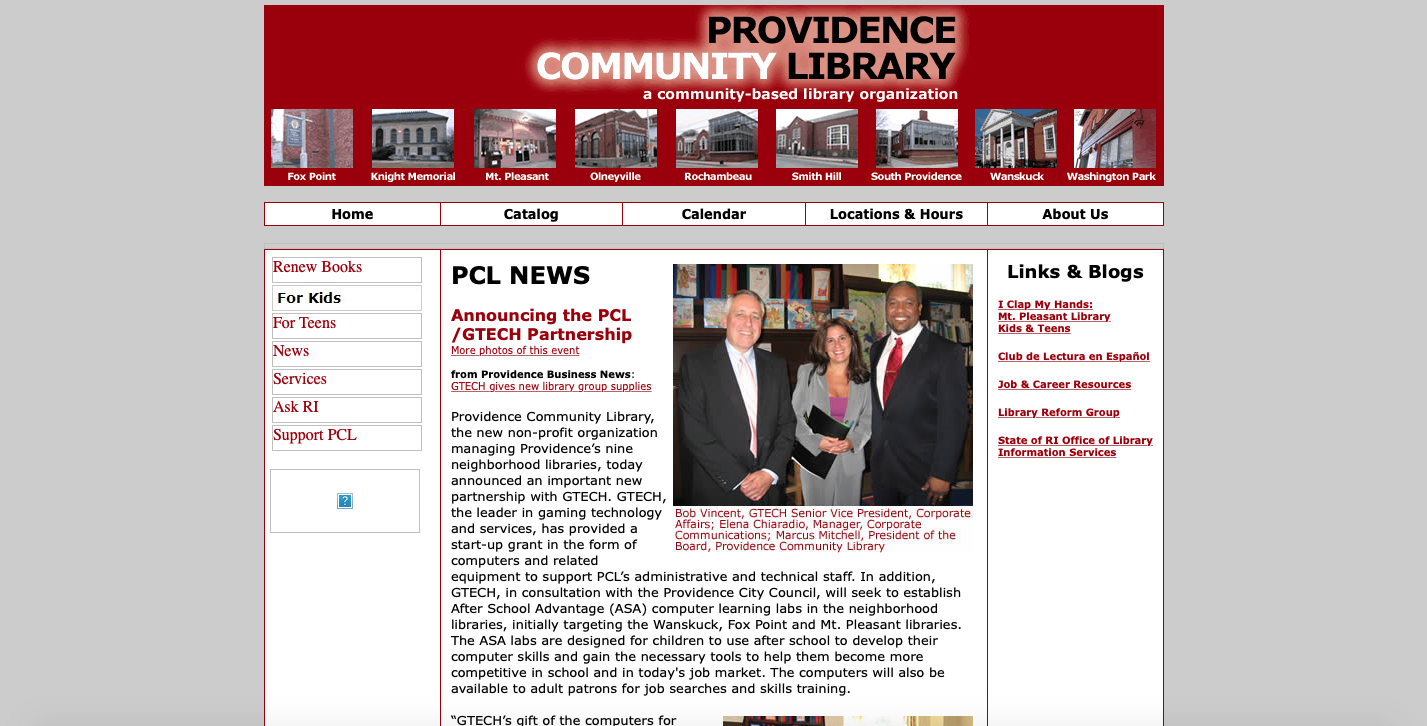
I chose to use the Providence Community Library's website for my lab assignment. The 2009 version of their website seems plain and slightly incomplete. It provides users with enough information about the library organization, its locations and hours, and current happenings. But it reminds me of a blog post and is not alluring in its presence. There are not that many navigational tabs, and the organization provides the most important ones, such as "Catalog," "Locations & Hours," and "Calendar." The homepage provides the latest news about the organization in a style that reminds me of a personal blog. I do like the banner which includes photos of each library branch. When a user clicks on it, it takes them to the corresponding library's location and operating hours. The images of each library is an excellent idea because it allows the user to see how each of the library's nine sites looks like. (See the 2009 version of the website here).
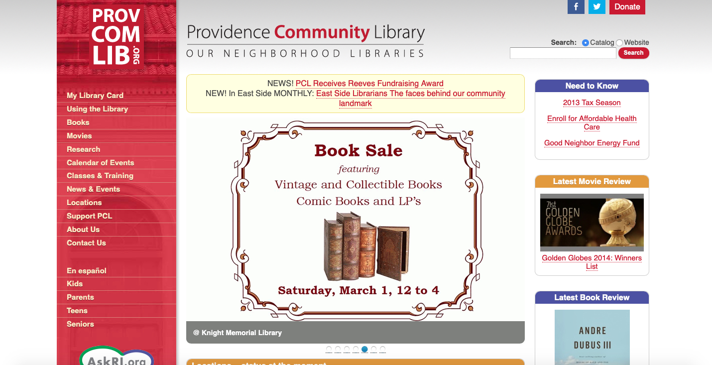
One of the most apparent aspects of the 2014 version of Providence Community Library's website is the added content. This version now has a separate box, towards the bottom of the second column, which displays the current status of the library locations. This addition is something one should have on top so the user can know which library is currently open or closed without having to navigate elsewhere. Also, this version of the website contains links to the organization's Facebook and Twitter accounts. This allows for patrons/library users to be able to connect with the organization in other ways. Visually a lot is going on, particularly with the columns, gallery slides, and separate informational boxes concerning books and movie reviews. It feels like too much. I do not know where to start and what to pay attention to first. (See the 2014 version of the website here).
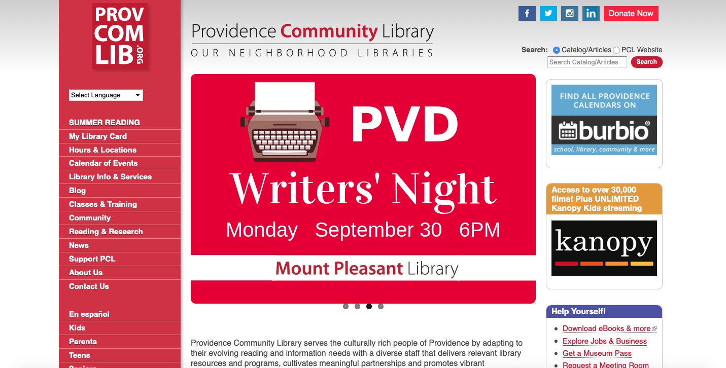
The current version of the website has an adequate amount of information. There still is a lot going on visually, yet it does not feel overwhelming. The organization's mission statement is visible upon visiting the homepage, which is an excellent addition. An added feature to the current website allows the user to translate the page to another language. Navigation wise, the website still provides a lot of links which are easily accessible and will not require a user to have to dig to locate the information. (See the current version of the website here).
There is a big difference between the 2009 and 2014 versions of the website. It went from having minimal content to having too much. They have more information on their webpage because they have more content, programs, and events to promote. Occasionally it felt like information overload. Aside from all three versions of the website having three columns, another aspect that has remained consistent is the use of the color red. Red was used in the 2009 version for the organization's homepage banner and is currently the color of their logo. In the later versions of the website they also added a tagline which reads "Our Neighborhood Libraries" which was not there in the 2009 version.
Key Changes
- More content
- Incorporated their organization's logo onto the website
- Organization's mission statement is on the homepage
Important Changes
- The homepage is promoting the organization's programs and events.
- User can translate the webpage to a language other than English.
- Added more social media links/icons to promote the organization on other kinds of platforms.
Timeline of Changes
| Year | Aesthetic Feel | Navigation Options | Content |
|---|---|---|---|
| 2009 | Simple and not captivating. | Has a decent amount of navigation options, but could use more. | Could use more information about the organization. |
| 2014 | Has a lot going on at once that I do not know where to look at first. | Has more navigational options, which is good because the user now has more to look at. | There is more information about the programs/events the organization organizes. |
| 2019 | Has a lot going on visually, but does not feel overwhelming. | Still has a ton of navigation options, including being able to translate the webpage to a language a user feels more comfortable with. | There is more content to promote in this version of the website. Not just programs/events but databases library users can gain access to. |
For Lab 1, I learned how to use the Wayback Machine website to search for different versions of the same website over a given time period. I also learned how to compare and contrast different versions of the same website based on the given prompts and my experience as a web user. I learned how to create an HTML document, how to insert headings, paragraphs, links, and lists onto the document. Before I started the lab, this sounded and felt really complicated. As I was completing the lab, it became a lot of fun.
For Lab 2, I learned how to add more content onto my HTML document. I learned how to add images and a table, as well as changing the font color of my header and the font style of my header and paragraphs. Like Lab #1, the steps to complete this lab sounded daunting but I feel great knowing that I was able to complete it. Particularly the part about adding images. I was worried the screenshots I took last week were not going to upload correctly.