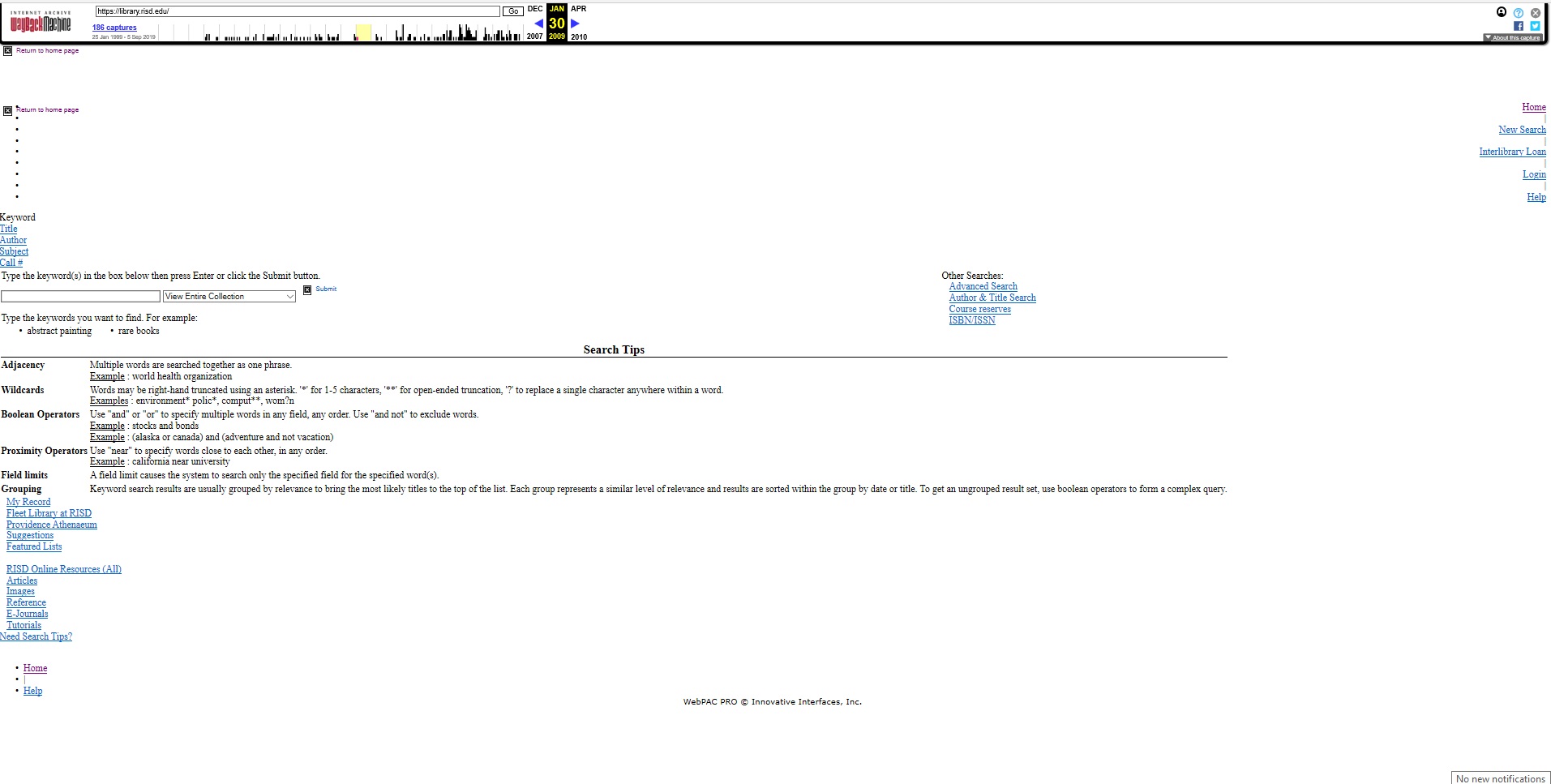
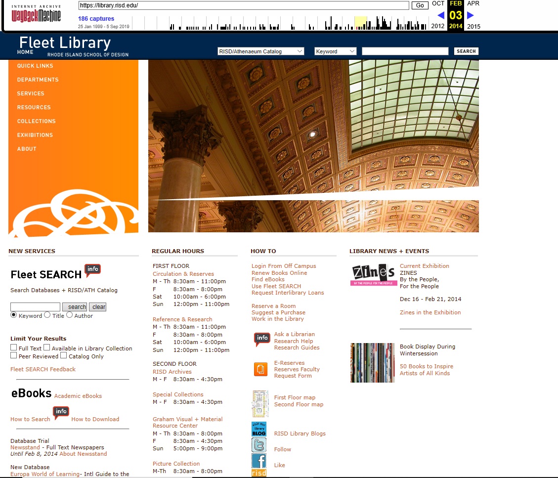
 The 2014 first snapshot and scrawl was on Febuary 3rd, this version of the Fleet library has the look of most state wide library websites all the tabs and tools are in a vertical pattern for viewers to navagate comfortable and easy. The main
tabs are on the left hand side of the screen on a orange panel the background is white with motion screen shots of the libraries interior space with the collection in decortve shelving units. The
hours of each department are posted. There are helpful tabs such as how to use tabs, the first floor map of the library as a visual icon, library news & events and the limit your results tab under the
Fleet Search info collumn. the only aesthetic feel of this version is the video slide of the interior space and a orange panel with the schools logo. The Navagation is not a problem its self explanatory
it reminds me of the Providence Public Libraries website. There is a wealth of content of the library with hours, contact info, and social media sites that the library is connected to for student needs.
The 2014 first snapshot and scrawl was on Febuary 3rd, this version of the Fleet library has the look of most state wide library websites all the tabs and tools are in a vertical pattern for viewers to navagate comfortable and easy. The main
tabs are on the left hand side of the screen on a orange panel the background is white with motion screen shots of the libraries interior space with the collection in decortve shelving units. The
hours of each department are posted. There are helpful tabs such as how to use tabs, the first floor map of the library as a visual icon, library news & events and the limit your results tab under the
Fleet Search info collumn. the only aesthetic feel of this version is the video slide of the interior space and a orange panel with the schools logo. The Navagation is not a problem its self explanatory
it reminds me of the Providence Public Libraries website. There is a wealth of content of the library with hours, contact info, and social media sites that the library is connected to for student needs.
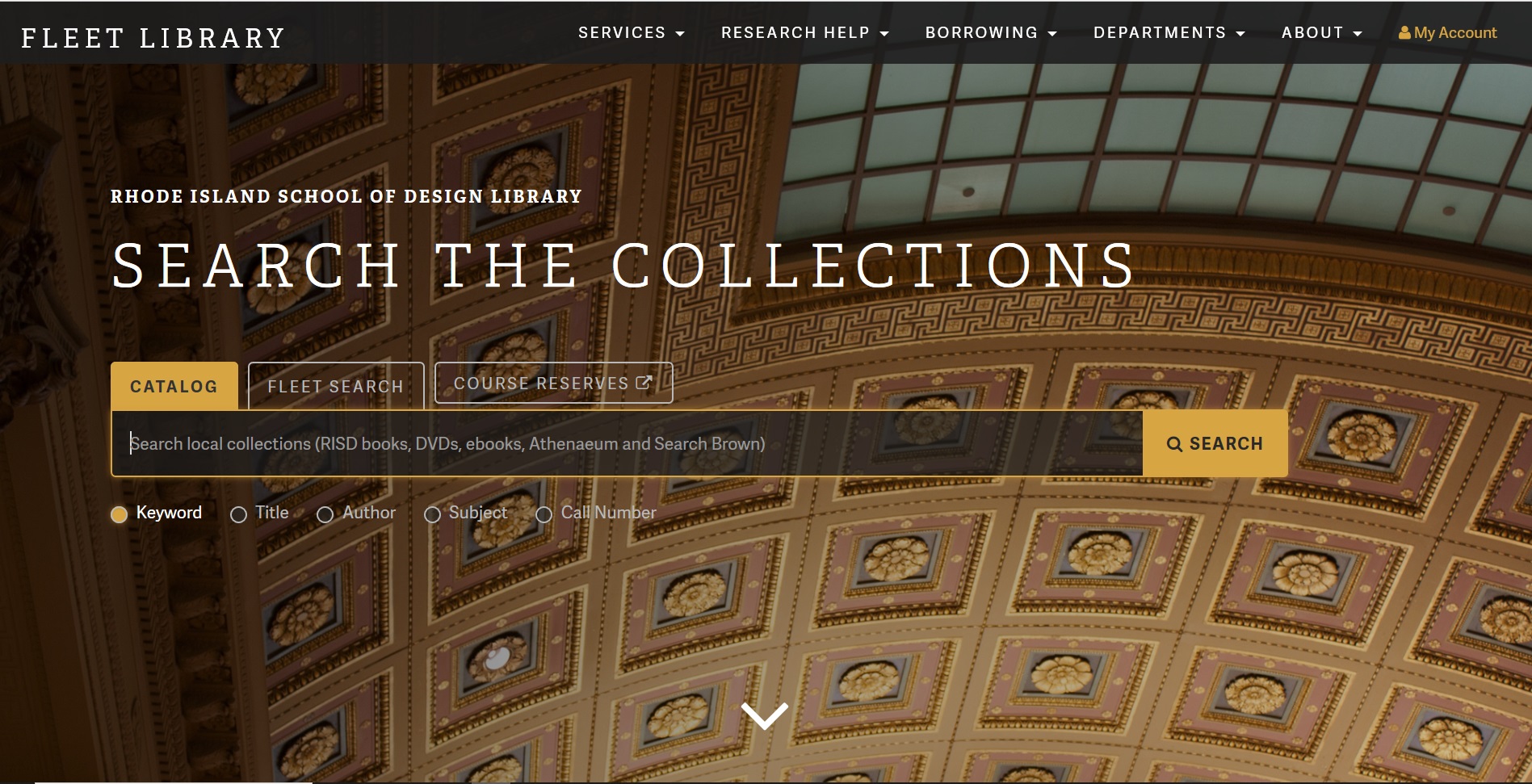
 For the 2019 present version there is a artist aesthetic to what the brand of RISD and its library is about as an academic institution. The interface is a snapshot of the ceiling of the Fleet libraries
first floor common room of the circulation department. There is a search bar with tabs on top for catalog, Fleet search and course reserves. Underneath is keyword, title, author, subject, call number as buttons.
Scrolling down there are tabs and menu selections against a white background with headers: Library Tools & Services, Collections, Todays hours, Maps, and Events & Exhibits. In blue text is upcoming events
calender with a featured collection with a scrolling picture presentation. At the very bottom against a black background with white and orange text are contact info, address, a tab for the hours and other related
questions. The aesthetic feel is very artistic to the schools brand and inviting to the viewer to navagate for information about the collection. The content is consistant with tabs and a search bar it, is not over
whelming with color and graphics and the different weights of the texts are appropriate for the viewer to navagate through.
For the 2019 present version there is a artist aesthetic to what the brand of RISD and its library is about as an academic institution. The interface is a snapshot of the ceiling of the Fleet libraries
first floor common room of the circulation department. There is a search bar with tabs on top for catalog, Fleet search and course reserves. Underneath is keyword, title, author, subject, call number as buttons.
Scrolling down there are tabs and menu selections against a white background with headers: Library Tools & Services, Collections, Todays hours, Maps, and Events & Exhibits. In blue text is upcoming events
calender with a featured collection with a scrolling picture presentation. At the very bottom against a black background with white and orange text are contact info, address, a tab for the hours and other related
questions. The aesthetic feel is very artistic to the schools brand and inviting to the viewer to navagate for information about the collection. The content is consistant with tabs and a search bar it, is not over
whelming with color and graphics and the different weights of the texts are appropriate for the viewer to navagate through.
In comparing all three versions the 2009 earlier site is a fail, maybe it was different at that time, but from what I see it is not helpful for information use. It is not aesthetically pleasing to the schools brand or marketing as a library. Even though the tabs are still active 1.a viewer can get lost in what and where to search 2.a viewer can assume they are on the wrong site and 3.One can get flustated and give up with their search. The 2014 version gets right to the point when it comes to searching needs compared to 2009's site. In 2014 the logo of RISD is expressed with the school colors there are visuals for the viewer to see what the eviroment looks like with inter-changing images. The tabs are relatable to other state wide and run libraries that are in plan site. The background of the interface is white with black and orange text, logo's of social media sites are present and active.The present day version is very artistic and it fits the brand of RISD and its library. This version has an upscale library appeal compared to the 2009 and 2014 versions. Has I said before the 2014 site looks like most state library sites and I'm almost certain that they were connected with program layout and design during that time period. The present day version is simplex but not lacking in content. Compared to to 2014's site there were tabs, icons, and logos to click on and navagate through, the present day version there are no icons or logos just titles and words. for example in 2014 there was a snapshot of the first floor map with a live tab, in 2019 the word sitemap is shown as a live tab the content is not lost just executed differently. The present day version is just as affective as 2014, but both are far better then 2009.
| Year | Aesthetic Feel | Navagation Options | Content |
|---|---|---|---|
| 2009 | None | The tabs and buttons are still active to navagate for some info | Very little content to know where you are |
| 2014 | There some aesthetics that is simplar to the state libraries | All tabs and buttons are active to navagate the site with visual infomation | Texts and visual content are present |
| 2019 | There is an artistis approach to the brand of the school and library together | All tabs and buttons are active to navagate for information | Texts is available with tabs and colored fonts replacing visual aids |
Working on Lab 1&2 was not as intimidating as I assumed it to be. With lab 1 I was able to perform each task properly with no problems. Moving on to lab 2 I was nervous with embedding photos and working with the measurements, after doing so and adjusting the measurement just by checking my work. I was able to problem solve on my own with both labs assignments and it made since. The Atom software was not a problem for me to work with and comprehend. The Atom's HTML back page was a little different with the HTML notepad, the Atom HTML has a dark (black) interface while the notepad is white. The dark interface is what I am used to when talking and seeing the process of coding with HTML and that was one of the things that intimidated me as if you're working in the void. I do like the reference of the W3School to go back while working with our lab assignment, and how you can cut and paste the information and then make simple adjustments. So far working with both porgrams in Lab 1&2 was a good learning process with web building and organizing content and information.