Usability Test of Clark Library Website
My test protocol was designed to gauge the effectiveness, efficiency, and user satisfaction with the Clark Libray website. The protocol included a series of four tasks that were chosen because they are common questions at the URI Reference Desk where I work, yet did not require authentication as a student or faculty. My brainstorming process involved listing tasks that I use the URI library website for, or questions I am asked at the desk, then attempting them on the UP site. The need for authentication then ruled out the braintstormed items that were not accessible for a non-UP student or faculty. In writing my script and chosing my tasks, I did take my users abilities into consideration as I did not want them to feel like I was trying to stump them. My test subjects were recruited from my family, and my family’s friends. User 1 is a high school freshman. User 2 is an undergraduate student who has 5 years of experience as an IT help desk consultant, and therefore has advanced digital literacy skills. Users 3 and 4 are recent college graduates. User 5 is faculty at a small college. Tasks 1 through 4 gauge the effectiveness of the website. The measurement of elapsed time gauges the efficency of the website. User satisfaction is gauged through admninistration of survey question on a 5 point Likert scale.
Usability Test Tasks
- What time does the library close on Sunday nights?
- Please use the library’s writing assignment calculator to plan a paper due Dec. 10, and tell me the date that the first draft should be complete.
- Please search for a print book on theater performance, and tell me the call number.
- Please tell me the title of a tutorial on searching databases.
I noted some interesting thought processes among my subjects. Some test subjects were confused by the University of Portland logo which links to the university homepage, as well as the menu along the right hand of the screen. User 1 was the only subject who only used the search field for the appropriate task of finding a book; the other subjects used the search bar to look for “tutorial” or “library hours.” Users 2, 3, and 4 (undergrads and recent grads) identified the call number easily; the other subjects found a book in the catalog but struggled to identify the call number, which is not clearly labeled as such. Two subjects stopped the testing momentarily to argue that my test question was erroneous, because the library doesn’t close on Sundays if it stays open until 2am, which is then Monday. User 2 “broke” the test by using prior IT knowledge to access the university menu’s search tool to find the answers to tasks 1 and 2, but that tactic failed to produce results for task 4.
| User | Task 1 | Task 2 | Task 3 | Task 4 | Elapsed Time |
|---|---|---|---|---|---|
| User 1 | Clicked non-hyperlinked current hours. Found correct link after two dead ends. | Entered “calculator” in Primo Search. Searched FAQ. Found under Productivity Tools. | Found Primo easily. Struggled read catalog record and identify LC call number. | Tried FAQ first, then found under Get Help. | 10 minutes |
| User 2 | Used University’s search in right hand menu to find library hours subpage. | Used University’s search bar to find writing assignment calculator. | Used Primo search tool. No limiters. Scrolled to print book. Found/identified Call Number immediately. | Tried University Search tool first. Tried FAQ second. Tried Get Help then saw Tutorials and found correct item rapidly. Recognized tabs in LibGuide immediately. | 5 minutes |
| User 3 | Clicked current hours (not hyperlinked). Struggled to return to homepage after clicking UP Logo; didn’t recognize that he had left library site. | Looked through FAQ then found under Productivity Tools. | Only tester to use drop down menu to limit Primo to “UP”. Found print book and identified call number rapidly. | Tried FAQ before finding tutorials under Get Help. Had trouble seeing that “Tutorials” was in another tab. | 8 minutes |
| User 4 | Clicked current hours (not hyperlinked). Struggled to return to homepage after clicking UP Logo; didn’t recognize that she had left library site. | Clicked FAQ then found under Productivity Tools. | Used Primo search tool. No limiters. Found print book catalog page and identified Call Number quickly. | Hesitated while looking for Get Help in left hand sidebar to find tutorial. Hesitated at identifying Database tab. | 9 minutes |
| User 5 | Entered “library hours” in Primo search bar before spotting Full Schedule link. | Tried “Get Help” then found under Productivity Tools. | Navigated Primo search easily. Struggled to identify LC Call Number on catalog page. (Used iPad; there was no Advanced Search option.) | Tried Productivity Tools then found under Get Help menu. | 10 minutes |
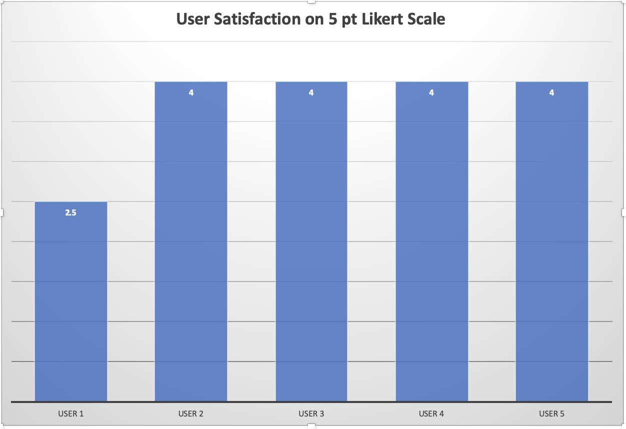
The third part of usability testing is user satisfaction, so I included a final question consisting of asking the users to give the Clark Library website a score on a 5 point Likert scale, with 1 being completely frustrating and 5 being conpletely satisfactory. This chart illustrates the results of from that question.
In conclusion, the Clark Library is of satisfactory effectiveness and efficiency. The test showed me the utility in redundancies, as all the test subjects accessed the tutorial through a different method than I had done so. (I used the button/tab attached to the Primo search tool to access Subject Guides.) All subjects were able to complete all tasks in no more than 10 minutes. User 1 struggled due to unfamiliarity with academic library websites and unfamiliarity with LC call numbers, which potentially impacted their low satisfaction rating. Any familiarity with other academic library websites translated to skill with this site for the rest of the users. User 2's search strategy illustrated why the pool of usability testers should be drawn from the target audience rather than computer specialists. There were a few consistent mistakes areas of
Lab 3 was a lot of fun because I never learned how to use internal CSS styles to control an entire page at once. I am really excited at how efficient it is, compared to inline styles. I'm still frustrated at my inability to figure out some of the tweaks that are needed to fix some of the formatting on my page. I tried several things, some of which largely worked, and some that I couldn't get to work properly this week. I had to research and try different options, for instance with my ordered list formatting, before it did what I wanted it to do, and that didn't always match what was in the tutorials exactly, and I don't know why yet. As far as usability testing is concerned, I am completely won over. Watching the test subjects and understanding their thought patterns and search strategies taught me a tremendous bit about how my patrons might be thinking and navigating the website as I am talking them through using the databases, or searching for books, or trying to find library policies, especially when they are on virtual chat or the phone. I wish URI did this for real, I think it would make them consider some ways to make the library website more user centered.
