Comparison of Clark Library Website
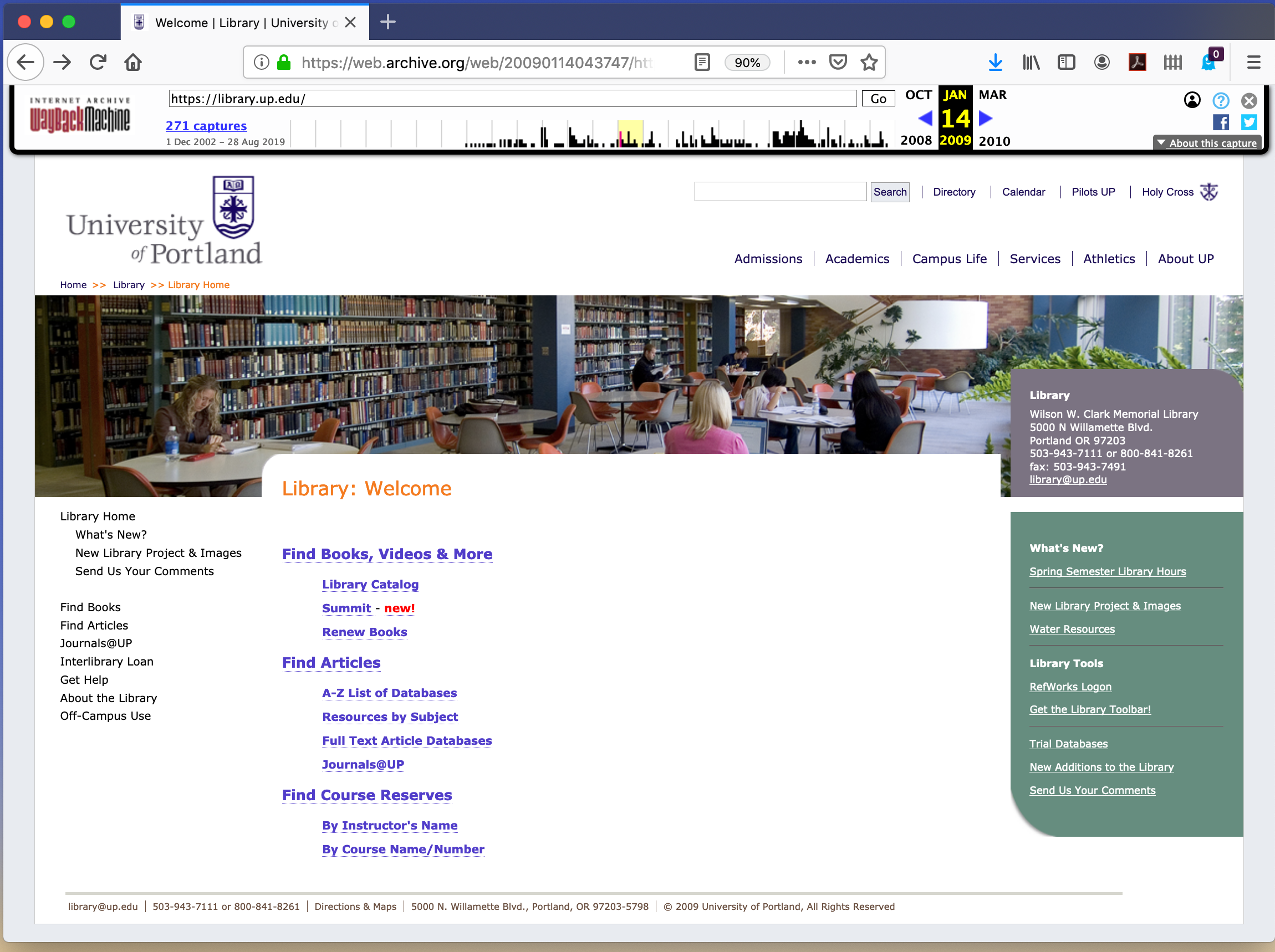
I chose to analyze the website of the Clark Library at University of Portland, OR, where I was an undergraduate work-study student in the early 90's. I analyzed the website chronologically, from oldest to newest. The January 22, 2009 website was accessed using Wayback Machine, here: Link to 2009 Snapshot. This website is visually uncluttered, and it is fixed width: it does not adapt when the width of the browser changes and it does not fill my modern laptop's screen dimensions. The entire home webpage fits in one browser window without any scrolling (vertical or horizontal). The header appears to be part of the overall university website, and contains "rollover" navigation to other university webpages; directing a mouse over the headings causes the subpages to appear below. The webpage features a photo of the library interior with stacks and students studying; this is a visual cue that you have landed on a library webpage. The photo is pleasant, of good photographic quality, and I would suggest that it may decrease library anxiety by providing a sense of familiarity to new students encountering the space in person, after having already seen it on the webpage. There are information boxes in grey and green with white text. The colors feel soothing and calm. The university colors are purple and white, but that is not reflected in the webpage content, which feels like a disconnect from the university. The top, grey box simply repeats the same contact information that is in the footer, so either the footer or the box is redundant. The lower, green box with the title "What's New?" contains links to featured information such as library hours, tools including RefWorks, and information about the new library building project, all of which are also listed in the left-hand sidebar or the main content in the central part of the page. To find out the library hours, you have to find a link to click. Aesthetically, there is plenty of white space so it feels uncluttered and calm-inducing, but at the same time, finding specific information is confusing between redundant links in multiple locations throughout the page and the small print. The navigation is clear, both in word choice and avoidance of specialized library lingo, and in navigability: anyone with basic internet knowledge will be able to figure out that they are clickable links, even though the style is somewhat dated looking back 10 years from today's standards. The breadth of content is fairly shallow, with 11 links to subpages in the left hand sidebar.
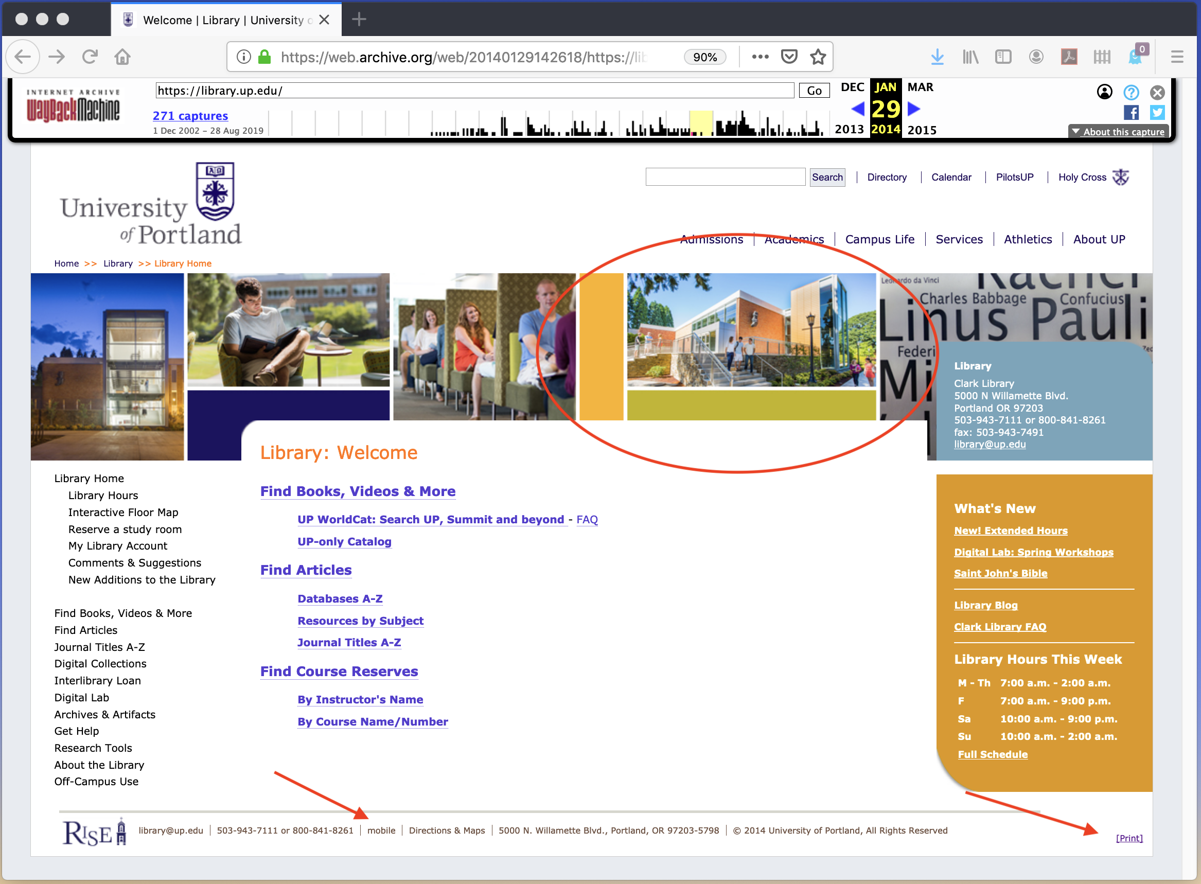
The first page from 2014 was saved by Wayback Machine on January 29, 2014. The 2014 page is very similar to the 2009 page in visual design. The university menus are "rollover" style so moving your cursor with your mouse over the words causes additional links to appear underneath. There are two colored boxes on the right hand side of the page with featured content. The upper box still has the same content: the library's address and contact information, but the background color has changed from grey to a medium grey-blue. The lower box has changed to a mustard color that coordinates with the new photo collage in the header; the white text on mustard is hard to read. It is titled "What's new" but without the "?" of 2009. The content now includes the library hours displayed on the homepage, without requiring navigating to a subpage. The content in the middle of the page has a number of redundancies with the information repeated in the left hand sidebar. There is a link in the footer for a mobile site, and there is a link in the bottom right-hand corner for a printer-friendly version of the site (see arrows on screenshot): this leads to a page free of the photo collage in the header as well as the elimination of the colored feature boxes, in order to save ink when printing. The photo in the header is a collage of photos, presumably of the new library building's exterior and interior. Visually, it adds a chaotic, cluttered feeling to the page. There is more content overall; the left hand sidebar now has 18 links to subpages.
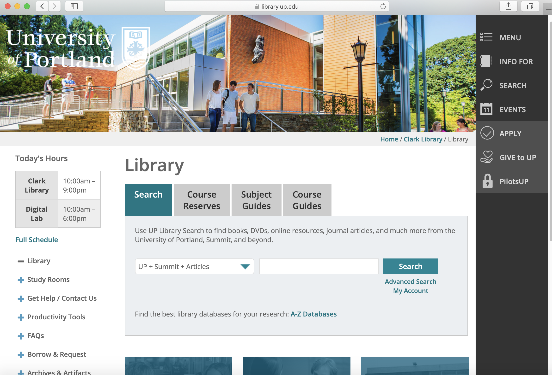
The current webpage for Clark Library is located at https://library.up.edu/ The first thing I notice is that their content includes a web-scale discovery tool, with tabs to course reserves, subject guides, and course guides. The second thing I notice is that the site includes responsive web design, which adapts when my browser margins are adjusted. The university navigation menu is in a dark grey sidebar on the right hand side, which adapts to show only the symbols when the page width is decreased. Navigation to library subpages is on the left hand side, and "+" signs indicate there is more information there if you click them; this may be fairly universal symbology for western viewers. A "What's New?" feature box is located under the left hand side links, also containing links to subpages, or to invite visitors to follow their social media pages; this has a very thin box around the content, with a bold dark grey title area and white text in the title area. Visually, the 2019 webpage has many contrasts with a bright, sunny photo of the library exterior as the header. The color scheme is a bright white background with active tabs in teal and light grey for non-active tabs. There are teal boxes with photos and titles that appear to be links to other featured information or sub-pages, for the Digital Lab, the Pilot Scholars, and the Digital Collections; when the cursor is moved over them, they turn purple. Navigation is intuitive for those familiar with using websites. Aesthetically, it feels modern, but also a little bit plain and boring, with minimal content. It does include an "Accessibility Statement" link in the footer. The page is dynamic, in that changing the width triggers changes to the page content; as the width decreases, the content adapts to the smaller space, and the university sidebar's words disappear and only the logos for each section are visible. There are also images at the bottom of the page to indicate links to social media, including facebook, twitter, linked in, instagram, and youtube; these are part of the overall university's web scaffold as those links, for instance, go to the university Facebook page, not the library's Facebook page.
The three iterations of this website have some similarities and some differences. The 2009 site is entirely information-centered, with little indication of user-centered design; the 2014 site is beginning to consider user needs, as shown by the addition of a separate mobile site and a printer-friendly view, but is still completely static and not particularly user-centered. The current site is finally showing user-centeredness through the way the site uses responsive web design, the prominent "web scale discovery" search bar, and the more friendly navigation options, and including the accessibility statement. The header, including the University of Portland logo, is the same between 2009 and 2014, and appears above the photograph; in 2019, the logo has been changed to white, and is superimposed on the photograph that appears at the top of the page. The photograph which appears in the current, 2019 version, is the same photo that appears as one part of the collage in 2014 (circled in 2014 screenshot). The visual design from 2009 to 2014 is nearly identical, with only superficial changes; the 2019 iteration finally shows major updates and redesign. One similarity between all three pages is the use of a "What's New[?]" feature box, (this is not visible in the 2019 screenshot because it requires scrolling to the lower part of the site). Course Reserves is also featured on all three iterations, as are "Subject Guides"/"Resources by Subject," and A-Z Databases, as well as a "Get Help" link. The new library building appears to have been finished between 2009 and 2014, because the 2014 and 2019 sites feature not only photos of the new building, but also content related to the new library spaces, including the digital lab.
Key Changes
- Content type and amount increases with each iteration
- Site becomes more visually appealing over time
- Site becomes more user-centered in the current iteration
- Shift to mobile friendly
Most Important Changes
- Site content is now more extensive with web scale discovery tool
- Current site is responsive and mobile friendly for access from multiple device types
- Aesthetics and visual design is modern and more attentive to ADA requirements
| Year | Aesthetic Feel | Navigation Options | Content |
|---|---|---|---|
| 2009 | Contemporary to time period so dated by today's standards; colors feel calm and reassuring; fixed width and height of site to fit in single non-widescreen computer monitor | Many redundant links to subpages; links from left sidebar, feature boxes on right, as well as central part of page; university links accessible by mouse-over to access dropdown menu | Minimal content on homepage and subpages; subpages not all saved by Wayback Machine so some unknowns as to full content available at that time |
| 2014 | Outdated; bold colors feel a little aggressive or pushy; site is fixed width, minimal cosmetic changes from 2009 site | Still has many redundant links to subpages; navigation essentially unchanged from 2009 site | Some additional content by way of links to subpages, but still sparse |
| 2019 | Modern, sleek; colors are contemporary. Site is dynamic and adapts to changing width of browser or viewing on mobile device | Navigation more closely aligns to current standards with addition of web scale discovery search box right on main page | Content has grown considerably but is still contained in subpages, no active content on homepage. More tools available via links such as research paper planner. |
My reflection on Lab 1 was that the html portion was a fun exercise, and ordered and unordered lists are a rather clever and time-saving trick. The most challenging part for me was developing a critical eye for analyzing the websites, and trying to find the correct terminology to describe what I was noticing. It was helpful to have guidance to look specifically at aesthetics, navigation, and content. I looked at the visual literacy aspects of webpages for my final project in LSC 528, but this lab called for other details that I found challenging to decipher. I would not have noticed many of these details otherwise, I tend to be more intuitive than analytical. Objective analysis is not as easy as it sounds, and I know I was subconsciously comparing this site to the URI Libraries site which I use frequently. In terms of technology, I have had trouble using "Text Edit" in the past, but I believe the tips in the video lesson may have been the key: I needed to change the settings in preferences, and then it worked as expected. Overall, this was a fun lab!
Reflecting on what I learned in Lab 2, we covered a lot of ground in the readings and tutorials. I am glad Dr. Mandel suggested that we do the exercises prior to working on our own index files, because that helped me with information recall as well as troubleshooting later. To get through the volume of content, the advice to do a few sections and then take a break was also really important to me; it would be easy to slip into information overload. I’m really enjoying learning this topic and I try not to squeal like a fangirl whenever something clicks. After the section on CSS, I am looking forward to learning how to make my own style sheet down the road. My webpage is not very visually appealing yet and that is driving me crazy, but I know I will learn more as the weeks go on. I will admit that the lab looked intimidating, and I am writing this prior to trying to upload it with FTP, which is the part I’m most intimidated about, so if you are reading this, I must have eventually succeeded!
