Comparison of BPL Websites
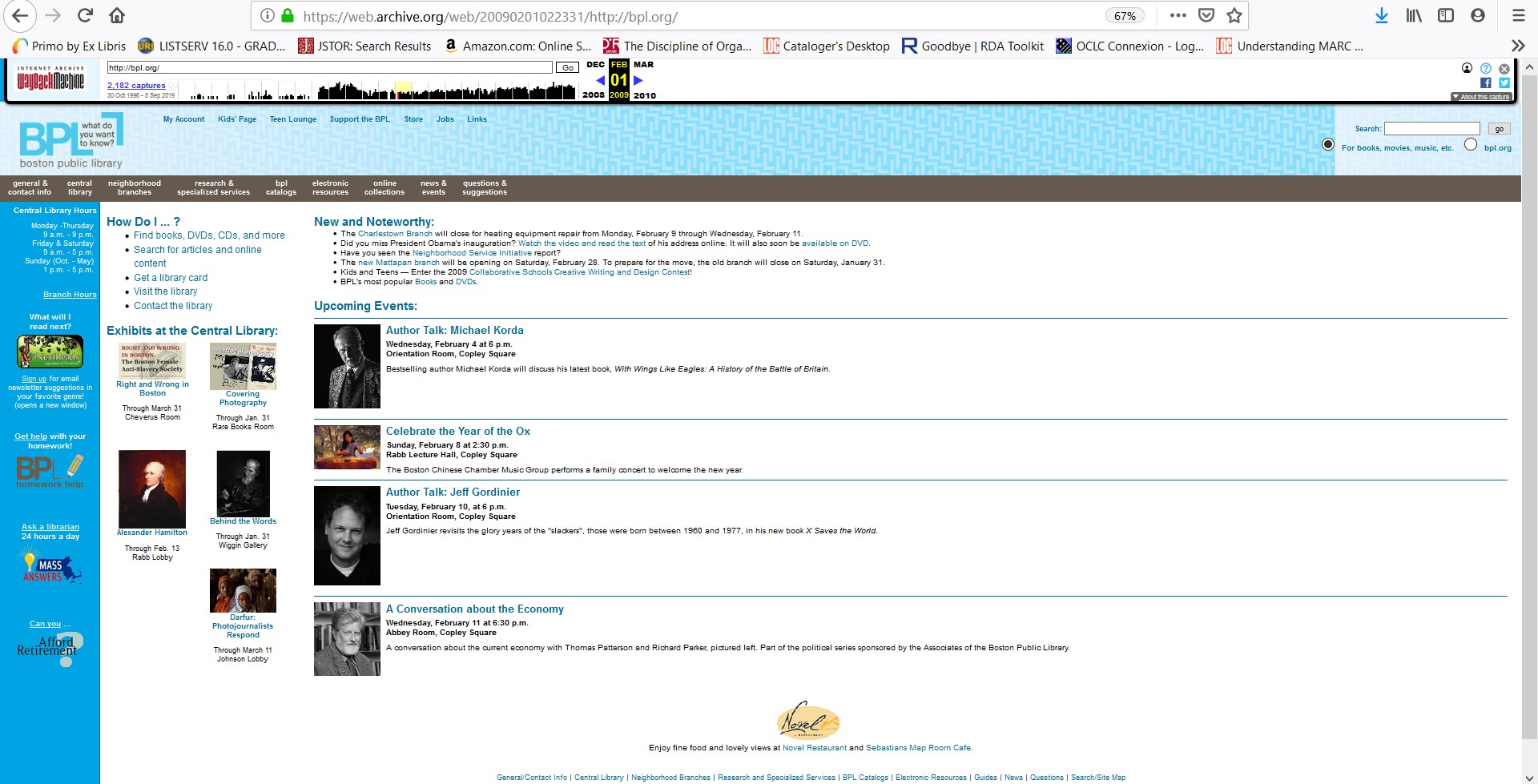
In researching library websites for the lab, I wanted to focus on the Boston Public Library for my preferred library, as it would interesting to see how their library’s website has evolved between 2009 to 2019. From a basic glance at each iteration of the BPL website, the aesthetic feel from each period tends to stick out. There is a distinct color change that is prominent in each website, as we see how the logo and color of the website has evolved over time. Focusing on the BPL website of 2009 first, the color of blue is based around the website. Even looking at the logo, it is different from what the logo has become in the present. The 2009 logo is based around the initials of the BPL with a box quote that states “what do you want to know?” It is interesting to see how the site arranged as the contents in the middle highlight the upcoming events and exhibitions in the library. The side bar on the page reflects the library hours with other information towards signing up for email, asking the librarian questions and more. Navigating to these sections a pretty easy when it came to the main page of the library website as I feel that patrons would find it easy to access these types of information. However, the same cannot be said about the navigation within the task bar of the website. In hovering over the different sections such as general contact, ecteronic resources, research services and others, there is too much information on one section. There certain pages that can be condensed so that it would not clutter section and there would not be much site navigation. Regarding the questions & suggestions section of the website, it irks me that there were questions directly on the main page that can be placed into the questions section of the website. Below is the screenshot to the 2009 Boston Public Library' website.
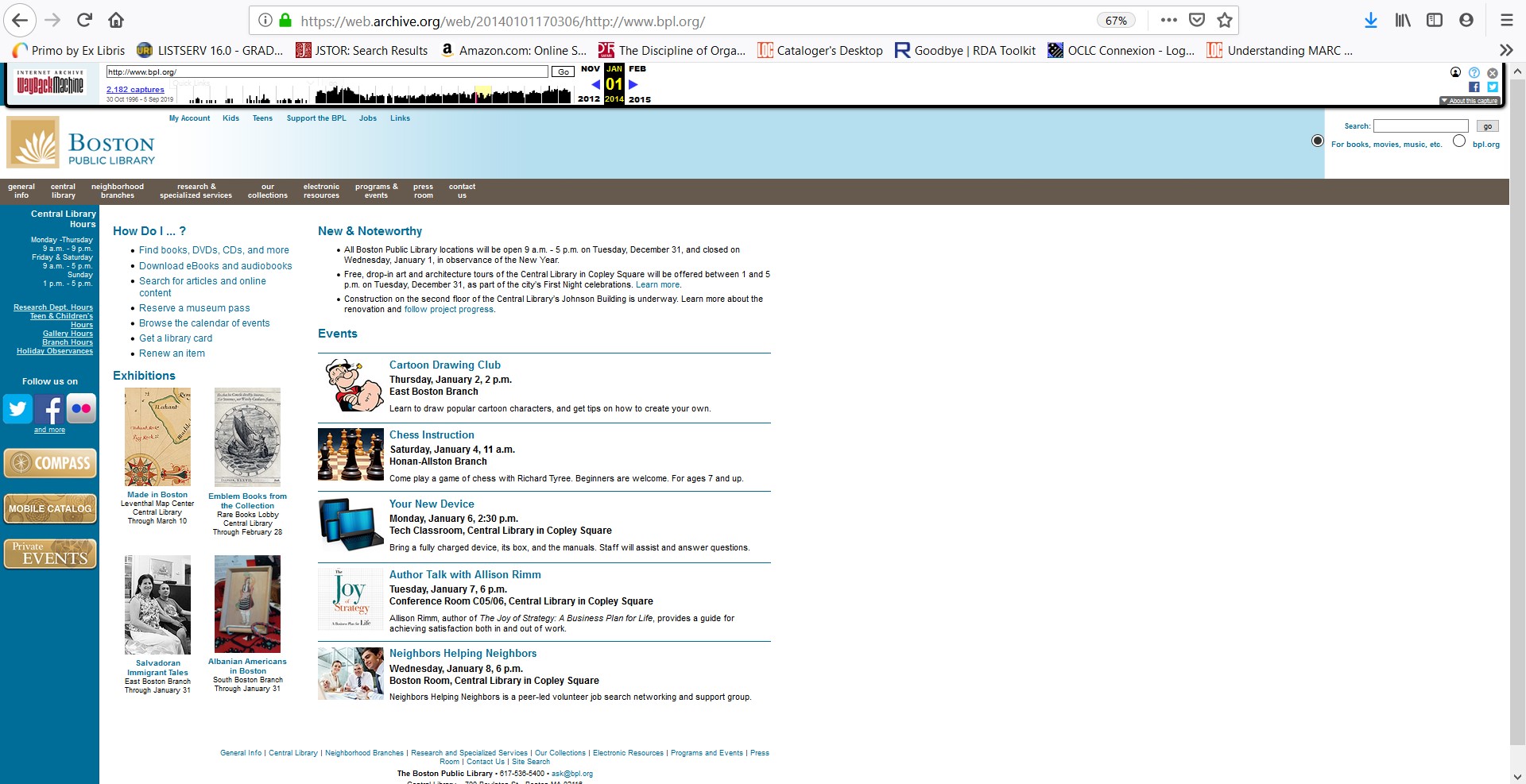
Now onto the 2014 BPL website, the colors of the websites are tan and blue with the logo resembling a book. The book symbolizes the change in the library’s design, gearing towards an image or a book rather than relying on a quote. There is an updated theme in the website with a fresh color change, although it does remain that same with how every information is displayed. There is more content on the side bar of the main library page, with links towards social media sites which is brand new. Seeing links towards YouTube, LinkedIn, Flickr was interesting to notice as the library was becoming more social media savvy. Also, on the side bar there are links towards different hours of the library which I found unnecessary as it can be placed in one section. It was not needed to have the hours displayed on the side bar, as there was a display of the library’s hours above those links. The navigation of the website still remains the same from 2009, as there were no changes. The task bar of the website added sections to “our collections” and “press room.” With the our collections section, I was able to find sections related finding aids, special collections and more. I do feel that this section is similar to the specialized research section. Below is the screenshot to the 2014 Boston Public Library' website.
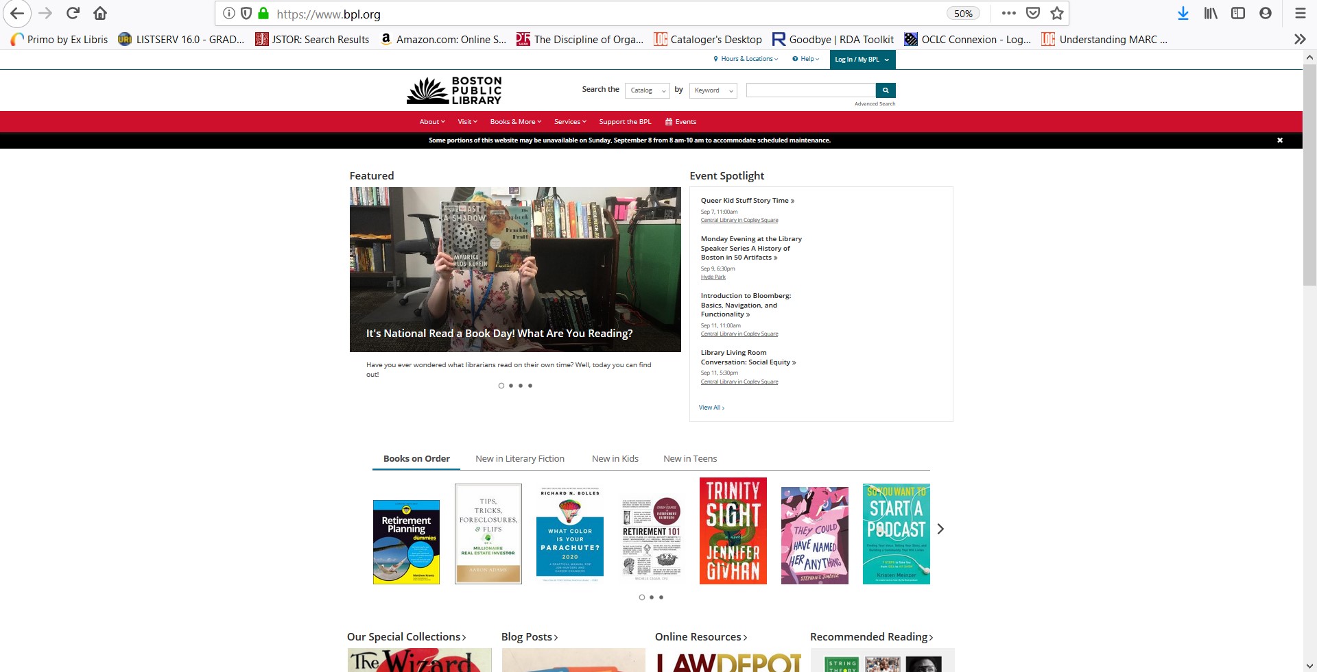
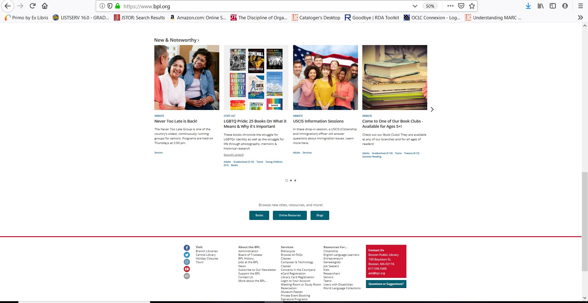
With the present-day BPL website, it feels more vibrant although it just a white background. Given that it is 2019, the website feels more interactive with the slideshow on the main page displaying different information. The color theme of the page is red and black, although they are slightly subtle with the amount of color that are displayed on the page. Right of the bat, we are able to see two sections spotlighting upcoming programs and links towards different sections of the website. As we scroll down on the library’s page, there is a stream of books related to new books and books on order. I feel this a great opportunity to showcase new books towards children, teens and adults. There are also sections related to online resources, staff recommendations, news and blogs. I feel that there is so much content that it does not feel overwhelming towards users. Navigation improved from past years, as users would be able to navigate the library’s website. The taskbar with sections related to books, services, about the library is more refined, as I feel it is necessary to have them condensed into one section. Below is the screenshot of the 2019 Boston Public Library's website.
Below is the second half of the 2019 Boston Public Library homepage.
Comparing all three BPL websites from various years, I feel that the 2009 and 2014 iterations remained the same when it came to displaying information, tabs and the content they provided. Although there were added sections, a new change of color towards the aesthetic and new logo in the 2014 websites, it was relatively the same throughout the 5-year gap. Now looking at the 2019 iteration of the BPL website, the changes are dramatic when it came towards how the information and sections are displayed on the website. As the previous years of the BPL had static images on the website, the 2019 iteration seems more interactive with a slideshow that prominent on the main page and various contents related to books, programs and blogs. The navigation is more refined, and the website is more user friendly.
In the process of working on Lab 2, I felt this was larger step from the first Lab as it provided bigger challenge on uploading information and understanding HTML. In reading the materials from the W3school, it was overwhelming with the amount of information that was involved in creating a great HTML document. By reading the sections about creating tables, lists, inserting images and more, it felt that I took a greater step on improving my HTML skills. With the basics of creating tags with paragraphs and headings, I felt a sense of accomplishment when utilizing the other HTML elements in the document. It was very challenging, as I had trouble in properly closing tags or adding HTML elements on top of another tag. Sometimes I forget that font-family and colors can be placed into to the same tag. Filezilla was an interesting program, as it seemed intimidating at first glance. However, after watching the example video from Professor Mandel, I felt more comfortable in using the program. The program is more based around dragging and sending files through our personal websites. Overall, this lab was very engaging as it took me out of my comfort zone and challenged me to improve my HTML skill.
Key Changes in Boston Public Library's Website
- Color of the website has changed over time, alongside the logo which now takes the form of a book
- Taskbar/Tabs are more refined as there is not that that much tabs that clutter the home page of the BPL
- More variety towards new incoming books and book recommendation options through the main page
- The catalog side bar for searching through the library's catalog is not on the far-right side of the library page, as it is now directly in the center of page
Changes in the Boston Public Library's Website, from most important to least
- The most important change is how the taskbar/tabs are displayed, as tab has different sections with their own information links to other resources of the library
- I would argue that having more options pertaining to library programs, events and new books are great change
- The library's search bar is displayed better, rather than having it off to the side
Timeline Table of Changes
| Year | Aesthetic Feel | Navigation Options | Content |
|---|---|---|---|
| 2009 | Static Images; Logo is a quote inside of a box; Light blue theme on the website; Empty space to the right of the homepage. | Navigation towards different pages in the website is through the cluttered tabs on the home page. | Not that much information is displayed on the homepage; Ask a Librarian section is small; Questions are on the main library page and has tab dedicated to them, making it redundant. |
| 2014 | Static feel is still prevalent in the images; Different shades of Blue with gold mixed into the theme; Logo is now a half-book; Still empty space to the right of the homepage. | Navigation remain unchanged from 2009 site. | More sections were included in the tab bar; Placement of sections are the same; Additions of links to the library's social media accounts. |
| 2019 | More vibrant and lively; Colors based around Red and Black; Logo is still the book, but is has the full book on display./td> | Navigation the website is better; The tabs of the website looks more sleek when placing the tooltip to the different sections; Search bar is now on the center of the page. | There is more content within the 2019 website, as it provides better location to information; Tabbed slideshow that is rotating news and events; Condensed version of the tab is at the bottom of the page; Sections for new books and ordering books; sections involving blogs, news, and programs. |