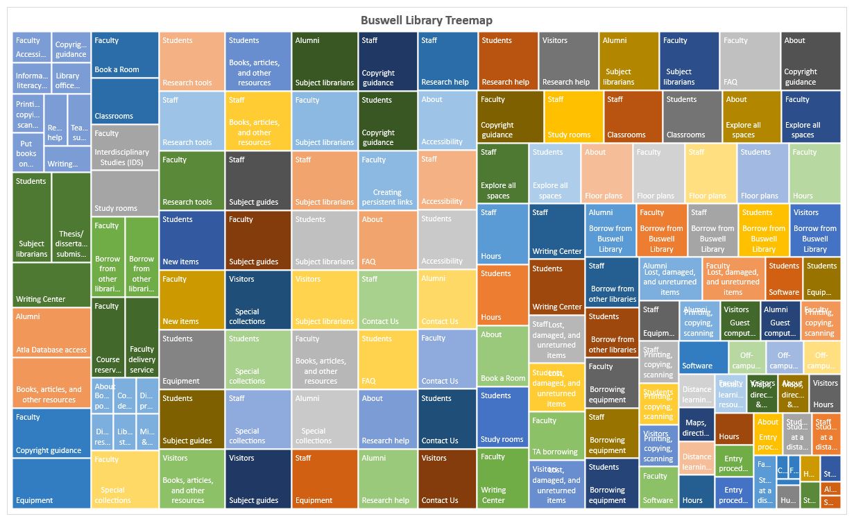
Treemap of Buswell Memorial Library's Website
To collect data for my treemap of the Buswell Memorial Library’s website, I started with the topics listed in the navigation bar at the top of the page. My parent level (or level one) consisted of Student, Faculty, Staff, Alumni, Visitors, and About. For each of these topics, I then recorded all of the sub-topics (level two) and subsequent topics under those (level three). Initially, I also included navigation topics located at the bottom of the page. However, these topics (e.g., Staff & Faculty Directory and Explore Spaces), only contained level two content. It was for this reason, and the fact that almost all of the level two topics were also found in the top navigation, that I excluded those items. Once I had data for levels one, two and three, I had to edit the wording to create a controlled vocabulary. For example, I changed a single instance each of “phone” and “email” to the predominately used “Contact Us”. Once I had standardized the terms and assigned weights, I created the treemap titled “Buswell Library Treemap” using all three levels.
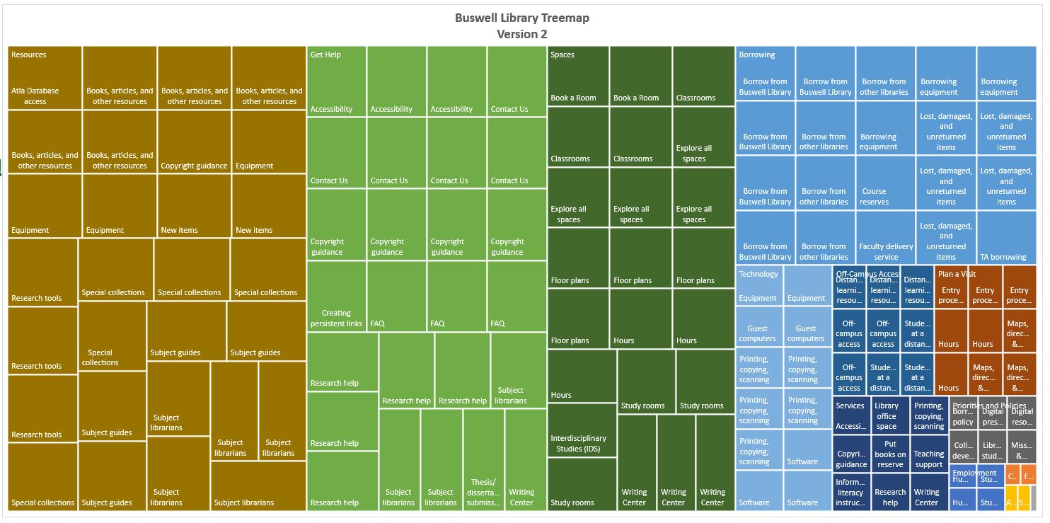
I then created another treemap (see “Buswell Library Treemap Version 2”) using just levels two and three. I think this version displays a more accurate hierarchy of the site. It is easy to see the broader topics, such as Resources, Get Help, and Spaces, and the related sub-topics. I am not able to see distinct groupings in the first treemap. I am wondering if it is because the majority of level two content is the same across all of the level one topics.
Completing this lab helped me to understand how data need to be structured in order to create a treemap. However, without seeing the raw data, I still don’t think I could interpret this type of visualization correctly. I think it’s difficult to see how each of the rectangles relate to each other, especially in my first treemap (above). I don’t think it makes it easier to see the hierarchal structure of the website.