Rebecca Valentine
Compilation of Labs 2-9
Click through below to see work done throughout this class.
Rebecca Valentine
I am currently in my last year in the GSLIS program, as I hope to graduate this coming May! I started in Fall 2017, after having worked in libraries for years; unofficially since 2012 and officially since 2014. I actually began as a volunteer at the Central Falls Public Library in 2012, after they had closed due to the city's bankruptcy they were able to reopen with only volunteers. I mostly started there because I was about graduate from RIC with a BA in history and I desperately wanted some work history and references. I found I that really liked working in libraries: it’s a really awesome feeling when you are able to connect library users with the information they want, whether that is a book or using the internet. I currently work in a historical library/archive in Providence, RI since that's really where my interest is and that has been a really rewarding shift.
When I’m not working or doing schoolwork (ha!) I love to read for fun, mainly fantasy, romance, and non-fiction. I like playing handheld video games, I’m pretty sure the Nintendo Switch was created with me in mind. Finally, I am also an avid baker, I am always willing to talk/commiserate about that.
Comparison of the Library of Congress Website
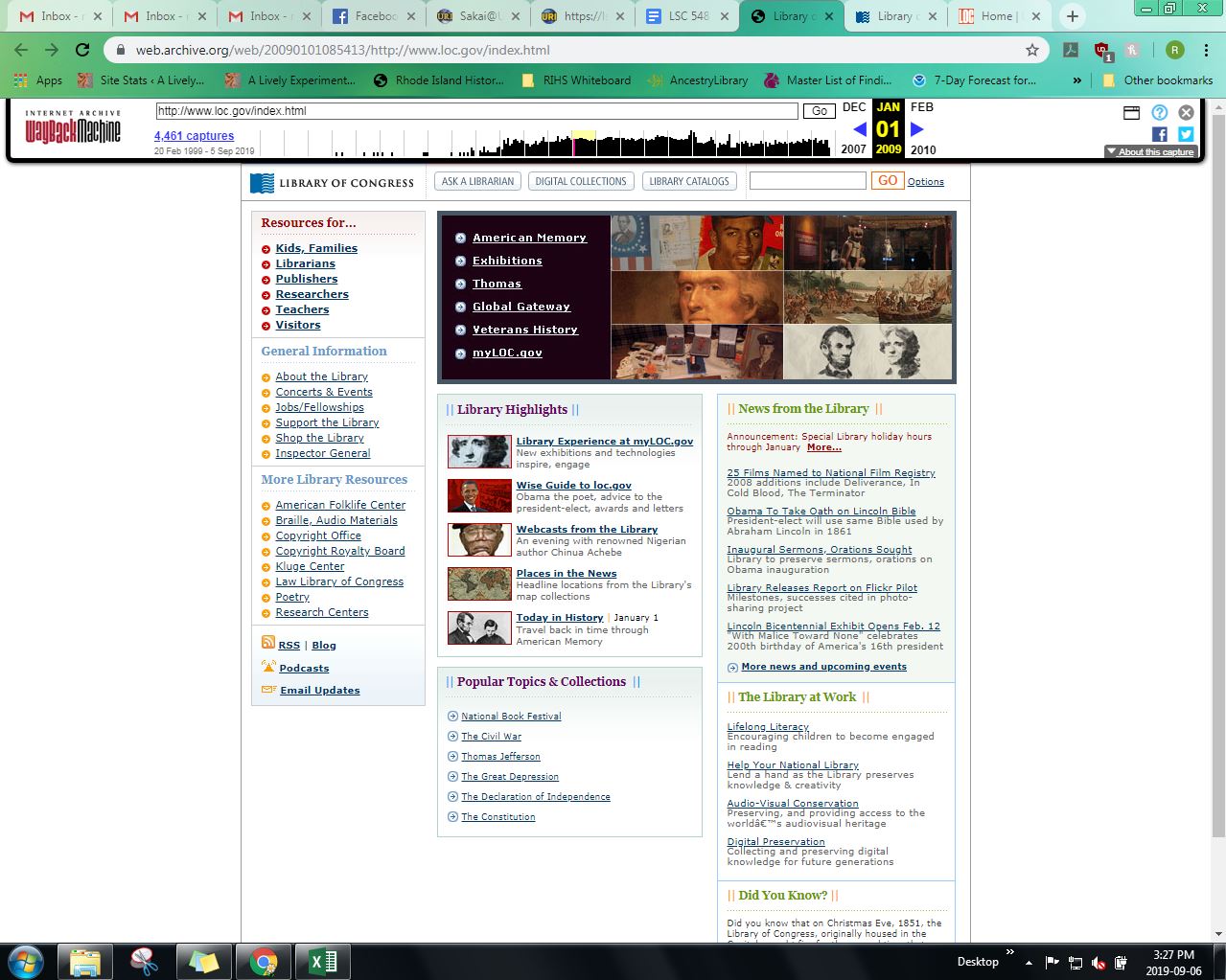
The 2009 iteration of the Library of Congress website can be found here. Aesthetically, the website feels literally blocky. Everything is sorted into squares, and there’s very little variance in shapes. Even the icons and images presented are squares or rectangles. This website also utilizes color as a means of emphasis and classification. There are blue, green, red, orange and purple. Overall all the effect looks a lot like what one would achieve using Word Art. Immediately, I can see a problem with accessibility because at least one section has red text on a green background. This could create reading issues for those with red/green color blindness. There is actually too many navigational options: nearly all the text on the page is a link or navigational button and it’s a little overwhelming to look at. The breadth of content available on this page not lacking. It looks as though every resource the library has to offer is available on this one page. However on closer inspection, there are a few redundancies. For example, the top section shows links on a black background that appear to be featured digital collections. Then towards the bottom of the page, is a section titled “Popular Topics & Collections,” "Thomas Jefferson" appears to be a repeated resource. Finally, except for the featured digital collections, most of the content that is presented is less about the collections and more about what other resources the Library is able to offer.
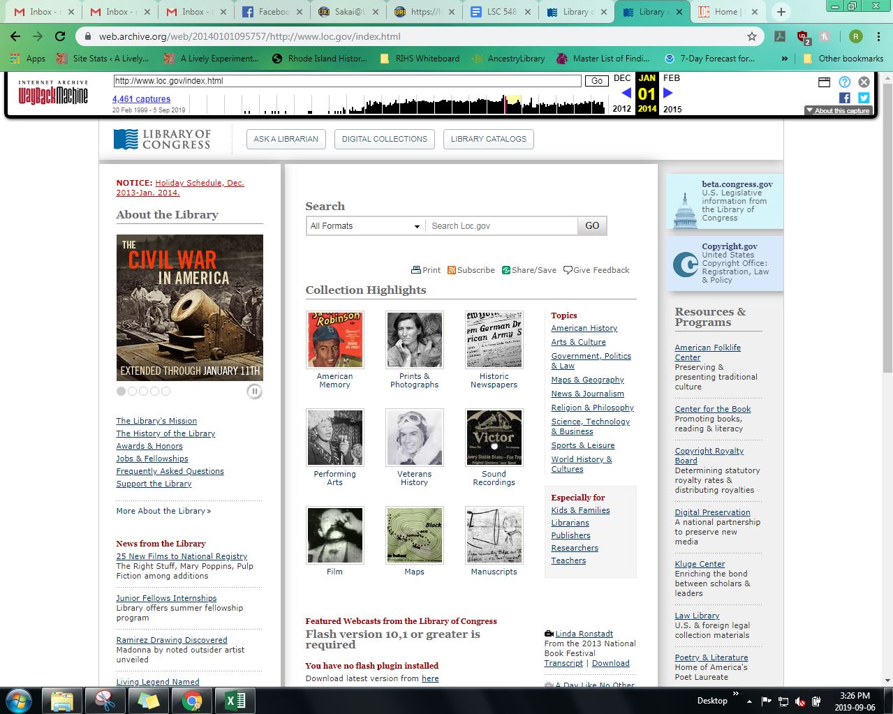
The 2014 Library of Congress website can be found here. The aesthetic feel of the 2014 Library of Congress website is fine, if a little visually overwhelming: there are a lot of links. The color scheme utilized is fairly monochromatic. It has a white background, and emphasizes the organization of resources through the use of different background colors, such as grey or off-white. The page uses the color red to emphasize many of the section titles or headers, and uses blue to emphasize the links. This could inhibit accessibility since red/green deficiencies are the most common form of color blindness. The navigation options are numerous, to the point of being almost overwhelming. There are dozens of links, and while there is a system of organization to them, it is still overwhelming. There are three buttons at the top of the page that allow users to skip over all the links, such as “Ask a Librarian”, “Digital Collections”, and “Library Catalogs”. There is also a search bar just under those buttons, whose default search option is “All Formats.” There is no lack of content on the page. Rather than sectioning off content under headers or buttons, it feels as though all of the website’s content has been shoved on to the front page. While that means that a site user doesn’t have to click through more than one link to find what they are looking for, there is almost too much content on this front page to actually find anything.
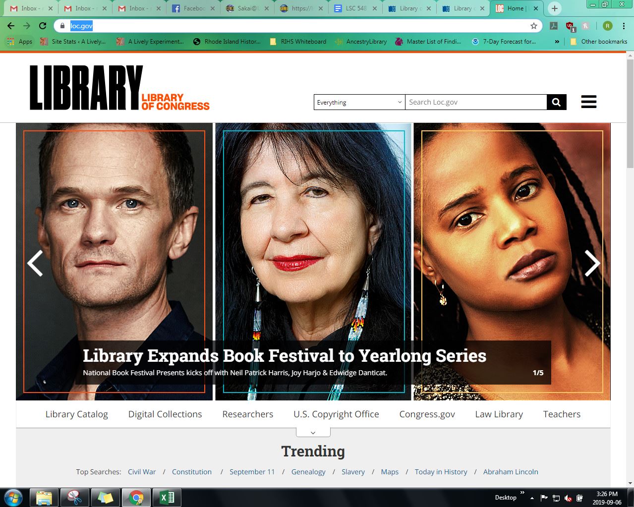
The current version of the Library of Congress website can be found here. The aesthetic feel of the site today is extremely streamlined, it’s trying very hard to look “modern” I think. There isn’t a lot of text, but there are many images. The page uses a pretty monotone color scheme, it's mostly black and white with a little bit of orange; making everything high contrast. The navigation options are numerous, though not necessarily obvious. Upon opening the website, the site users are faced with a scrolling image banner that takes up most of the screen. In the top right corner, is a search bar, which defaults to searching everything and a button with three lines for more options. The headers are located just under the banner. However, depending on the size of the computer, they aren’t visible until the user scrolls down a little. If one keeps scrolling, then exhibits and upcoming events are promoted, along with a featured open access image gallery. The content of the website seems to be all over the place, there are online collections, the actual library catalog, resources for teachers and librarians, policies for visiting the brick and mortar library, featured events, and even social media. This website could easily induce information overload because of the sheer amount of content, I think that the design of the page, and the oversimplification and reliance on images are ways to avoid overload.
There are quite a few differences between the three versions. The most obvious differences between the three years is aesthetically. The layouts are very different. Most dramatically between the Library of Congress website today and the two older versions. There is progressively less color in the backgrounds and texts. The navigation in the earlier iterations were heavily reliant on textual links with images for emphasis, while the site today navigates with images that are links with very little text. What seems to be mostly the same, is the content of the sites. There are still links (however they get presented) to resources such as exhibits, the Constitution, for teachers, and digital collections to name a few. The website today also streamlines how resources are presented. Rather than just throwing every resource at the website user immediately, the user is instead encouraged to navigate to other pages for more options. Over all, the site today appears to have been designed to avoid information overload and to have better accessibility.
- Less text, more images
- Increased contrast
- Change in terminology (example: "popular" to "trending")
- Layout
- Color Scheme
- Logo
| Year | Aesthetic Feel | Navigation Options | Content |
|---|---|---|---|
| 2009 | Blocky | Too many links/buttons | Redundancies found |
| 2014 | Monochromatic | Overwhelming | Excessive |
| 2019 | Streamlined | Organized by headers | Not all available on one page: encouraged to click through headers |
Because I have taken LSC 508, I had some familiarity with creating headings, paragraphs, text color, and page breaks. However, the most important thing I learned during the process of this lab was that I could check my work in the browser. I think that was a really handy tool. In 508, we were working in google sites, so I kept having to save and exit edit mode to check my work. So I think editing in a text editor and checking my work in the browser while keeping the notepad tool open certainly makes editing HTML a little easier. The rest of what I learned in this lab was a few more tags, such as an ordered and unordered lists, and adding links. I know that there isn’t a point of memorizing the tags of HTML because they are easy enough to find with W3Schools, but you don't know what you don't know. So it’s helpful to have a starting/reference point.
Lab 2 was a bit overwhelming. There so were many W3 tutorials to go through, that it felt like I fell behind in lab work pretty quickly; especially since nearly all the tags beyond the color and font were new to me. Additionally, despite clicking through all the examples, and taking all the quizzes, implementing the required HTML tags and elements was sometimes a little difficult. I especially struggled with creating the table. I had to save the file and refresh my browser quite a few times before I figured out which tag would effect which cell. Although, that does mean that successfully creating that table, definitely comes with a feeling of accomplishment.
Usability Test of the Library of Congress Website
The reading I went with for class was Azadbakht, et al., “Everyone’s Invited” (2017), their process for usability testing was to use an even mixture of navigational questions and questions about searching for specific library resources (pg. 37). I chose to have my questions reflect that. Some of the questions I came up with were finding operational hours, tour hours, how to contact, times when the chat feature was live, finding a book, finding a newspaper, finding a type of image, finding a 3D object. Of those possibilities, the four questions I went with were:
- Task 1: When is the latest you can tour the Library of Congress, Thomas Jefferson Building on a typical Saturday?
- Task 2: When is the best time to chat with a librarian online?
- Task 3: Check to see if LOC has any historic Rhode Island newspapers digitized.
- Task 4: Find a book by Roger Williams (the founder of Rhode Island, he lived about 1604-1683).
What I was looking for was time spent on each task, methods they used to find answers (click through links vs. using the search bar) accuracy of answers/ability to answer, and what they thought about the website: were the tasks easy? Frustrating? As well as noting if and where they got stuck. I did this by timing each participant and taking notes as I observed each person as they completed the tasks. The people I asked to participate were, my fiancé (User 1), two former coworkers (Users 2 and 3), and two friends (Users 4 and 5). This group was made up of a teacher, two reference assistants, a MBTA technician, and a QA tester. So hopefully a healthy mix of backgrounds.
The results were interesting. User 1 got visibly, and audibly, frustrated while looking up newspapers and books, especially since they began the search using the site’s search bar. While using the actual print catalog, User 1 wasn't sure about some of the terminology used by search fields, though they did manage to find the correct search function eventually. User 2 got confused when they used the site’s search bar while looking for the newspaper and frustrated with the book search until the user found the print catalog. User 3 took a little longer than previous user, however they were far more confident/less confused by the layout of content and navigation, and even managed to find more than I did when testing out questions. User 4 forgot certain aspects of the tasks, such as finding a Rhode Island specific newspaper and assumed the task was done upon finding the digital newspapers. Although it should be noted that this user was the only one to find the site's designated page, “Chronicling America”. Additionally, they found a book about Roger Williams rather than BY Roger Williams but assumed they were done. User 5 showed some signs of frustration especially on task two. They used the search bar to try to find answer, and instead of the correct page being presented immediately, they found a very overwhelming F.A.Q. page.
My conclusions are that despite the efforts that have been made towards usability, as seen from my previous lab work, I’m not sure that this library has yet to truly achieve that goal. In fact, some of the efforts that the Library of Congress have made, might be what inhibits ease of access for some users. The Library has added a large scrolling image banner to the website, but depending on the size of the monitor, it inhibits a user’s access to the headers located just underneath. Additionally, the search bar on the home the page leaves something to be desired. It technically searches the entire site, including webpages. However, how it presents those results isn’t clear. It presents them almost like a public access catalog, but with no efficient way to narrow down results. This was particularly true when users were looking for books: there was no good way to narrow the search by author. The results page did allow to narrow by contributor, but contributor appeared to include more than just author, and it was not consistently offered when searching. Additionally, One user, User 5, blamed themselves rather than the website when they ran into problems.
| User | Time | Method | Accuracy | User Comments |
|---|---|---|---|---|
| User 1 | 11:41 | Clicked through links tasks 1 and 2. Attempted to use search bar for tasks 3 and 4. | All answers were accurate. | "The site was mildly user friendly, but it’s very busy. As someone who is not a current student, academic or librarian, using the search bars was not very easy." |
| User 2 | 4:30 | Clicked through links tasks 1 and 2. Attempted to use search bar tasks 3 and 4, switched method halfway through task 4. | All answers were accurate. | "It's not the worst website. The slider images on the homepage were too loud. They took attention away from navigational headers. So I ended up using the search bar rather than direct links." |
| User 3 | 6:48 | Clicked through links for task 1. Found a direct link halfway down homepage for task 2. Used search bar for task 3, and found catalog immediately for task 4. | All answers were accurate, though one differed from my own finding. | "It's a pretty good website." |
| User 4 | 7:02 | Began with search bar for each task. Switched to searching links/headers on task 3. | Yes on the first two, either missunderstood or forgot parts of tasks for 3 and 4. | "The home screen was bit too much. Also my gut tells me to go to the search bar, so it's odd that it’s not great at searching." |
| User 5 | 6:52 | Defaulted for search bar for each task. Took a break from task 2 because unsuccessful at first, on attempt number two, found link on Homepage by scrolling down. | Yes, for tasks 2, 3 and 4. Answer was slightly off for task 1, but it was how information was presented, given a range (2:30 - 3:30) and gave the last part of that range. | "Aside from task 2? It's fine if you pay attention to the website. I kinda missed the Ask-A-Librarian feature on the home page." |
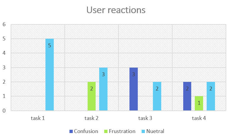
What I learned in this lab is that there should be multiple ways to access information on a website; i.e. there shouldn’t one “correct” way. Additionally, what something is called/named also matters. The newspapers digitized by the Library of congress are part of a collection entitled “Chronicling America”. During the process of this testing, I witnessed all five users pass by the link because it was not very clear that was what they were looking for. The one user who managed to find it, used “CTRL + f” to search the page for newspapers. It is also clear that in the age of Google and Amazon, search bars are what people use when looking for information, especially if it is not immediately obvious where to go on the site. But how those results are presented is even more important. And finally, the amount of time spent does not necessarily reflect how frustrated a user gets when using a website. User 2 spent the least amount of time searching the site, but got confused about resources at least once.
Treemap of the Library of Congress Website
This was not an easy task for the website I chose. First, there is no navigational bar to help decide Level 1 content. Additionally, the dropdown menu content doesn’t match everything that appears on the homepage. So I had to determine my Level 1 content by searching for headers in the coding; luckily, the h2 tag was used for the title of each section. After that, it was a matter of transcribing each link under each header then following each link and looking for more headers. I did all this directly in Excel which I chose over Sheets. Size also played a factor: this is a very large website, and I'm sure that despite my best attempts, I missed something. Finally, I chose to use Level 2 and Level 3 in my treemap graphic because there was so much data, it was too large to display legibly on my computer screen.
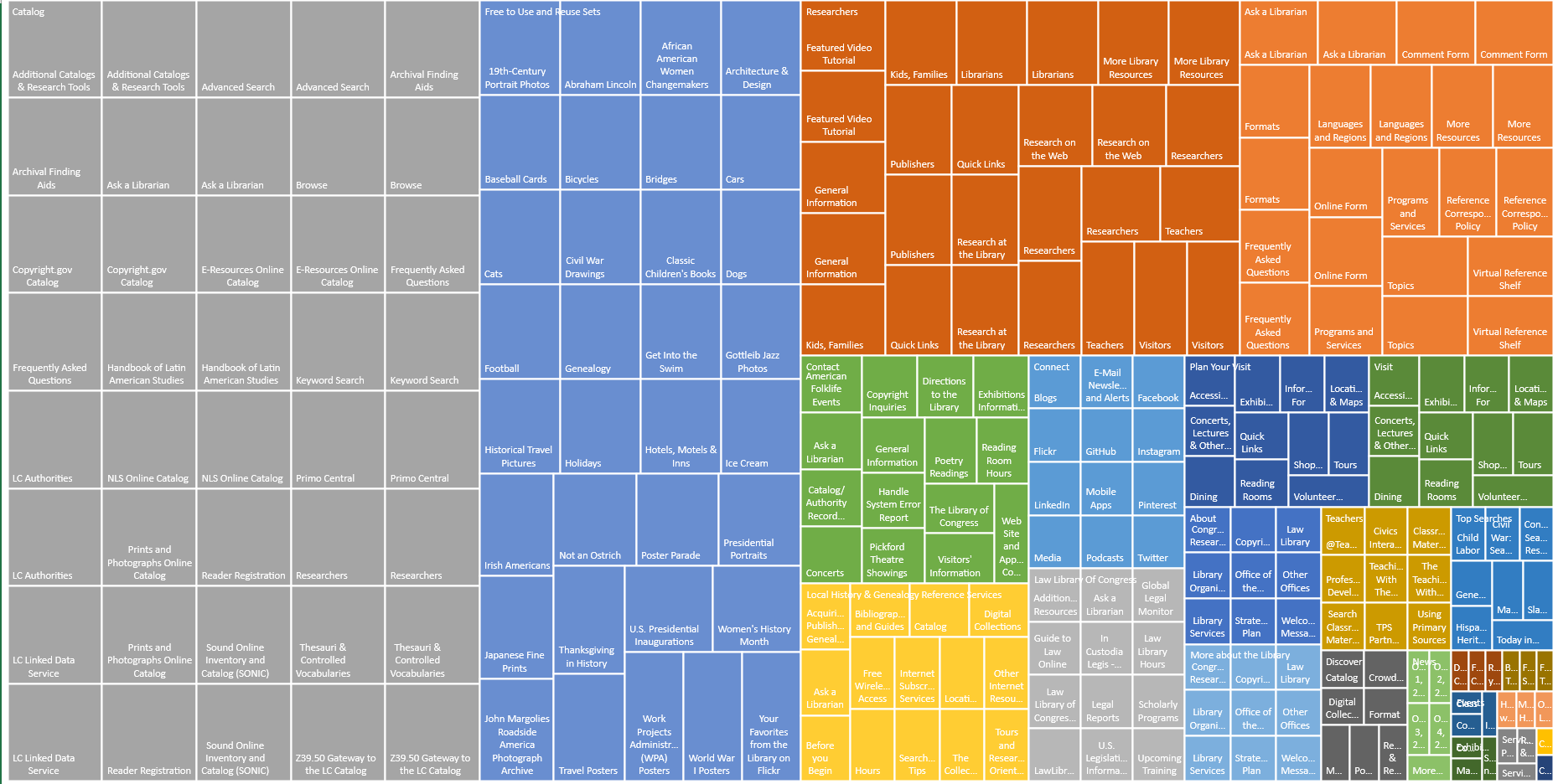
First, I learned that I dislike treemapping; This website was large enough that I dreamed about transcribing all the webpages. Honestly, aside from the time it took, I didn’t have problems with the process of creating treemaps. Additionally, I can understand how treemaps can be a useful tool for visual learners; that the size of each box shows their weighted prevalence, which could be used to determine importance. However, it’s too visually overwhelming for me to find helpful. When I was reading Bauder and Lange (2015), I wasn’t able to interpret their treemap at all. After I watched the lesson, I developed a better grasp… but honestly, it’s only after creating the data myself that I am able to truly grasp any meaning. I guess that means that the most important thing I learned during the lab was how to interpret treemap graphs.
JavaScript Buttons and Hover Functions
A Phone App Created Through Code.org
You view this project here.
Works Cited in Lab Work
Azadbakht, E., Blair, J., & Jones, L. (2017). Everyone’s invited: A website usability study involving multiple library stakeholders. Information Technology and Libraries, 36(4), 34-45.
Bauder, J., & Lange, E. (2015). Exploratory subject searching in library catalogs: reclaiming the vision. Information technology and libraries, 34(2), 92-102.