Comparison of Nashville Public Library Website
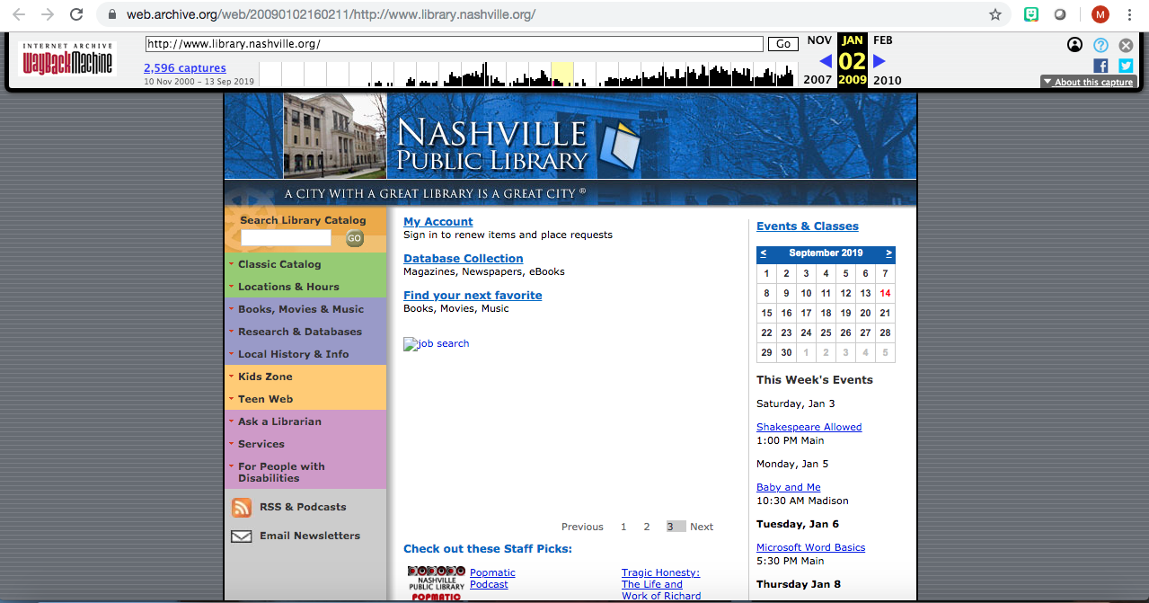
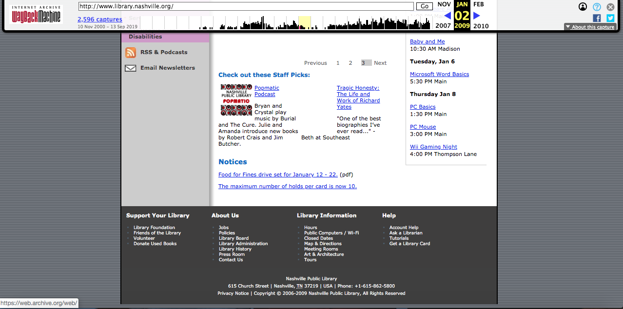
The aesthetic feel of the 2009 website is quite different than it is today. The narrow layout and gray background looks dated and is not very aesthetically pleasing. While I do like the colors they have chosen for the sidebar menu, there does not seem to be any color scheme throughout the whole website. There is a picture of a book that seems to be a logo in the upper part of the website, but as a standalone image does not obviously represent the Nashville Public Library. The navigation options are not terrible; the library catalog is easily accessible from the main menu. Along the sidebar there are links to kids resources, databases, library hours, etc. There is a link to a calendar listing different library events. There are headings, such as Notices, but the font size they had chosen makes them blend in with the rest of the text. While it is not that pretty to look at and admire, it is definitely functional. As far as the breadth of content, the website displays all the important features of a good library website; easy access to the catalog, as well as important information about the library. There is information about fines, and how many books can be put on hold at one time. There are also staff picks and recommendations all on the homepage. Check it out here.
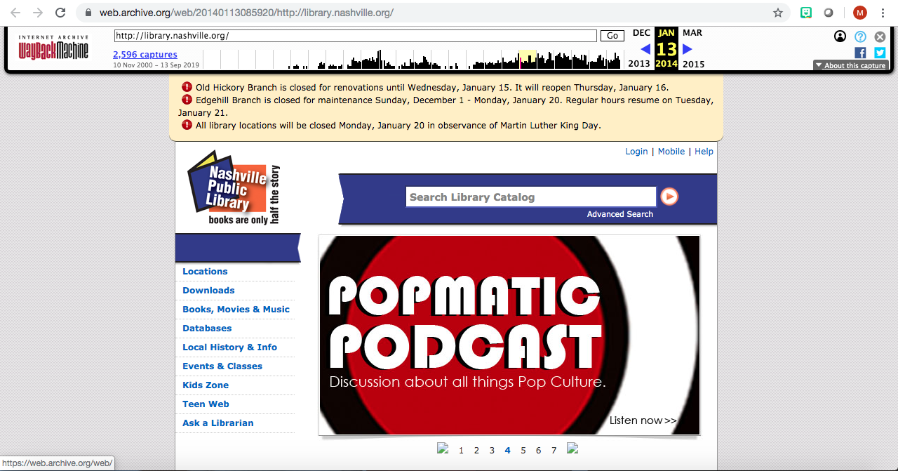
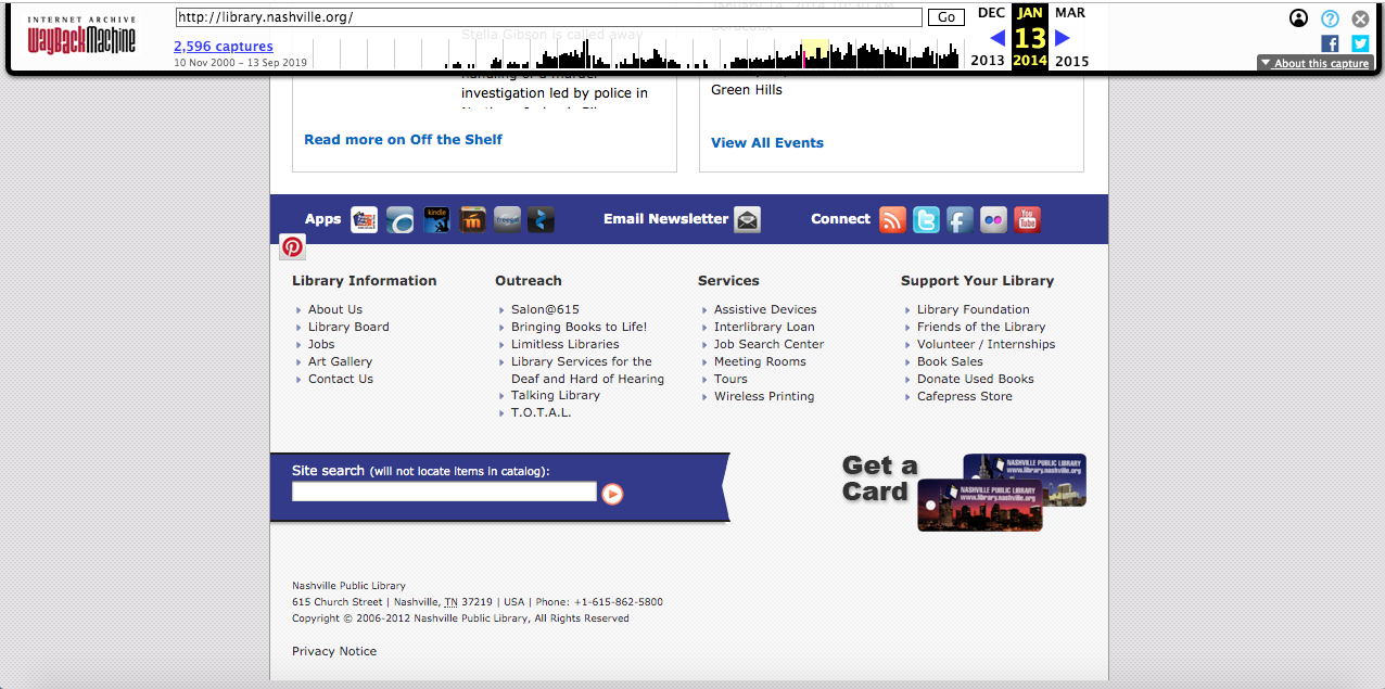
The 2014 version is more aesthetically pleasing, with a less drastic gray background. A logo has become present, and as a standalone image it is evident what it stands for. A color scheme has begun to arise, as the menus now match the logo, using yellow, blue, and orange throughout the site. The navigation options are still decent; the library catalog is now one of the main focuses of the website, placed in the header next to the logo. Links to social media such as Facebook, Pinterest and different kinds of library apps are on display in the lower portion of the homepage. As far as breadth of content, information and links about the library and its resources are still listed on the left sidebar. Large photos about upcoming events and programs are displayed in slideshow form on the main page. Check it out here.
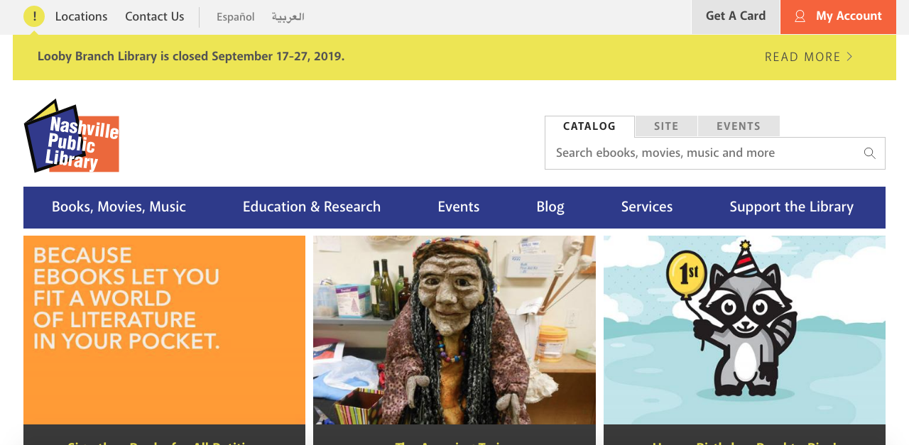
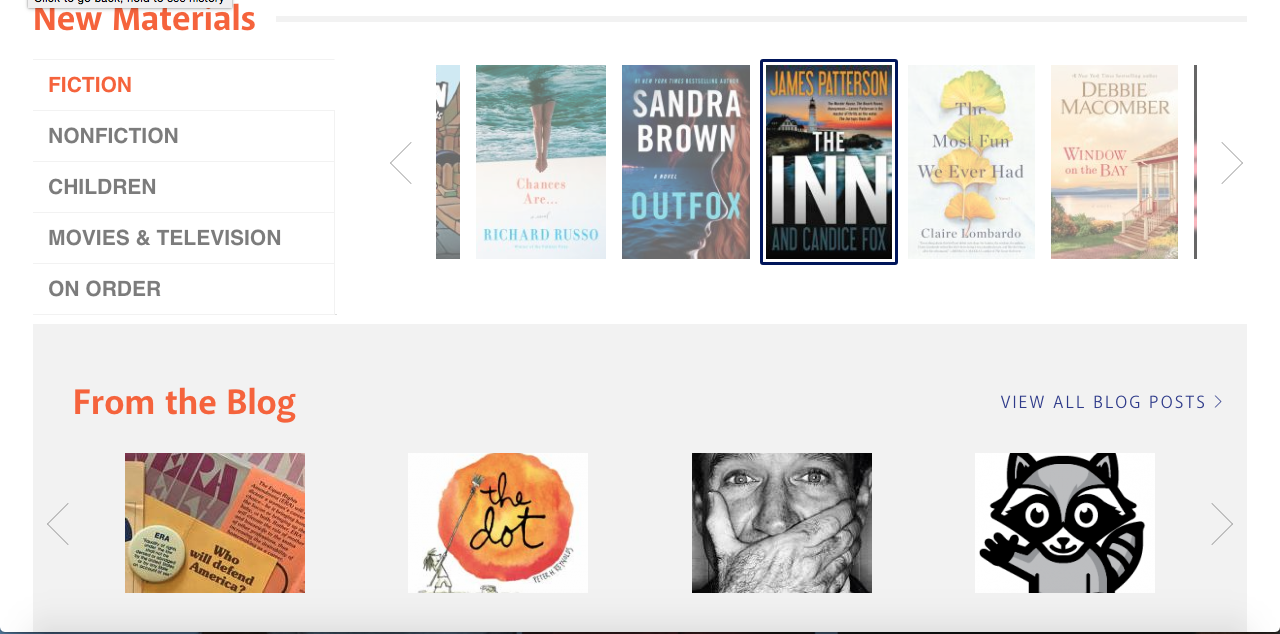
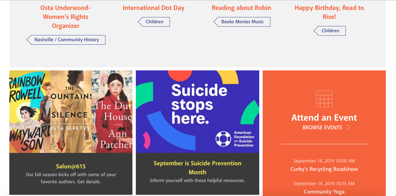
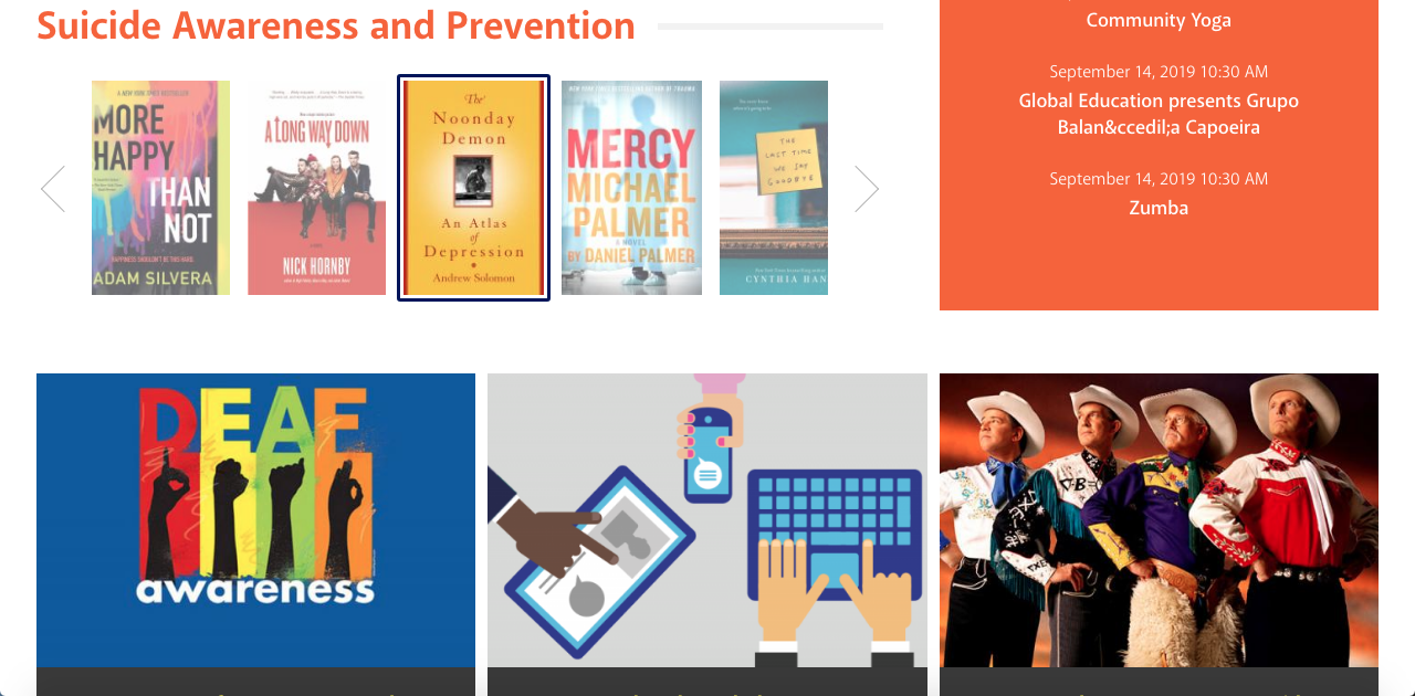
The aesthetic feel of the current 2019 version is obviously the most modern; the library logo has pretty much stayed the same, with a couple minor updates. The yellow, blue, orange color scheme is even more evident; the main menu is blue, while side menus are orange and special announcements are yellow. The sidebar menu items have now been moved to the top main menu, giving access to links about books, and other library services in drop-down menu form. There are aesthetically pleasing images in a grid like fashion which, when clicked on, bring you to different information such as book lists, book clubs, and different events around town. The navigation options have been even more updated with the catalog search bar still part of the main header and now also featuring a search bar for the whole site as well as the events page. As far as breadth of content, there is even more information displayed. Basic information like adult and children's materials and databases are displayed in the main menu via drop down menus. New materials, separated by category, are now displayed in the left sidebar menu for easy access. Different book blogs and links are displayed in the middle of the menu and the calendar and list of events is displayed on the left sidebar. Check it out here.
Starting with the 2014 website, the presence of the yellow, blue, and orange logo has appeared, while the 2009 website simply has a header with a picture of the library as the background and an image of a book. The 2009 version is the most different out of the three; there is no color scheme in that version but the 2014 and 2019 versions have a consistent color scheme of yellow, blue, and orange to match the Nashville Public Library logo. The 2009 and 2014 versions are similar to each other in that they are both quite narrow, whereas the 2019 version is much more updated and larger. The 2014 and 2019 versions have much more aesthetically pleasing and functional menu items to help users navigate around the website.
Here is a list of 3-5 key changes over time:
- Website got progressively wider
- Better layout
- Color scheme more consistent
- Logo starting in 2014
- More advertising images
Here is a list of important changes, from most to least important
- Library catalog and other links more prominent and easily accessible
- Consistent Color Scheme
- Creation of a logo
| Years | Aesthetic Feel | Navigation Options | Content |
|---|---|---|---|
| 2009 | Narrow, dated, no color scheme | Easy access to links, library catalog, etc. | Good information about fines, library borrowing rules, and recommendations |
| 2014 | Less drastic gray background and now presence of a logo | Library catalog more prominent and now links to social media | Information and links still displayed and now large photos promoting services and resources as well |
| 2019 | Most modern, color scheme most evident | Updated catalog access and an improved search bar | Implementation of drop-down menus, links to book blogs and databases |