Usability Test of Boston Public Library’s 2019 Website
I began brainstorming by recalling basic questions I might receive at the reference desk and over the phone at my library. I was focused on usability, functionality, time, and satisfaction. There were specific layouts/functions of the website that I thought might be problematic, so I wanted to test if my thinking was right. I recruited my two roommates and my brother who are all in their late twenties. My mom who is in her early sixties participated, as well as a coworker who is in her fifties.
Possible Tasks:
- Finding hours and locations
- How to log in to my profile
- Finding online resources
- Searching the catalog
- How to access e-books
- Finding events – look at events for this weekend
- Going to the library’s Facebook or other social media page
- Use the search tool to search the website. Try searching for special collections
Main Usability Tasks:
- Finding hours and locations. The standard for success is satisfaction and time to completion.
- Searching the catalog. The standard for success overall functionality and comprehension.
- Finding events – try looking at events for this weekend. The standard success is time to completion, satisfaction, and comprehension.
- Navigating to the library’s Facebook or other social media pages. The standard for success is time to completion and overall functionality.
| User | Task 1 | Task 2 | Task 3 | Task 4 |
|---|---|---|---|---|
| 1 | Clicked on visit, then about, then saw hours in the top right and entered in zip code. Took 53 seconds. | Found the search bar immediately. Tried searching for "Harry Potter and the Prisoner of Azkaban" and understood the catalog. Took 37 seconds. | Immediately found “events” on the taskbar, then saw the option to view events for “this weeked”. Took 13 seconds. | Immediately thought to scroll to the bottom of the homepage. Took 15 seconds. |
| 2 | Clicked on visit, then branch libraries and found their hours, then went back to visit to see the main branch hours. Took 37 seconds. | Clicked on books and more from the taskbar, then chose books from the drop down menu, clicked books on order, was confused and went back to the home page, scrolled through the home page then went back to the top and saw the search bar for the catalog. Took 1 minute 43 seconds. | Immediately found “events” on the taskbar and then saw the option to narrow events to “this weekend”. Took 13 seconds. | Immediately scrolled to the bottom because remembered seeing the icons earlier. Took 10 seconds. |
| 3 | Clicked on visit, then central library. Understood that hours for the main library could be found by clicking on “central library” under “visit” tab. Took 40 seconds. | Found the search the catalog immediately. Decided to try a search to see if the catalog was user friendly and found what she was looking for right away! Took 49 seconds. | Saw the “events” option on the taskbar and clicked. Then saw “this weekend” as an option to narrow event results. Took 30 seconds. | Clicked on “about” with no results, then “visit”, then scrolled through the home page and saw “blog posts” but continued scrolling to bottom where she found links for social media sites. Took 1 minute 20 seconds. |
| 4 | scrolled to the bottom of the page to look for hours, then clicked on “about” then saw the “hours & locations” at the top of the screen! Clicked on “see all locations”. Took 26 seconds. | Immediately saw the “search the catalog” at the top of the page. Decided to search for an author and was happy with the usability of the catalog. 60 seconds. | Saw the “events” tab in the taskbar and clicked it. Then found the option to the left to only look at events for this weekend. Took 25 seconds. | Clicked on “about” in the taskbar and then on “contact us” on the drop down. At the bottom of that page is a “Social Media” category with links to Facebook Instagram and Twitter! Took 45 seconds. |
| 5 | Clicked on the “hours & locations” at the top and became confused when a drop down menu appeared. Clicked on “see all locations” but was disappointed when only today’s hours were displayed. Had to click on a specific branch to be led to their hours. Took 29 Seconds. | Noticed the catalog search quickly, roughly 9 seconds, but noted she wished it were bigger/more pronounced. | Immediately clicked on “events” in taskbar and found “this weekend” option. Took 15 seconds. | Knew that social media is on the bottom of most sites. Took 4 seconds. |
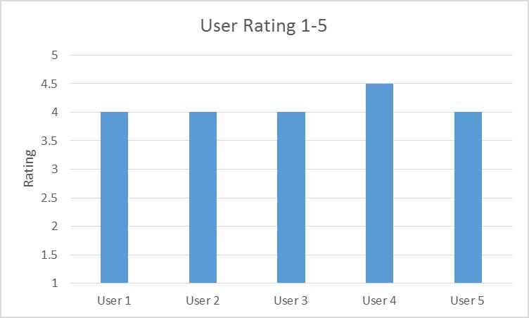
I had my participants rate the library website in overall usability and satistfacton from 1 to 5. 1 being not at all user friendly/very unsatisfied, and 5 being very user friendly/very satisfied. The average rating was 4.1 stars.

Conclusion
I learned something new with user 4. He went to “contact us” via “about” on the taskbar. No matter what tab or page you’re on there are clickable social media icons at the bottom of the page. That was what I intended for my participants to find. I was glad to see some new routes and tactics to navigate the website. Overall I think that BPL's website is very user friendly. There are a couple things, like the hours and locations, that most of my participants tripped over. It could possibly be looked into further and possibly updated.
Lab 3 Reflection
I thought that removing all of my style keys was terrifying. I knew that everything would be okay and nothing would look different on my website, but it was nerve wracking non the less. When I first formatted my site to CSS the fonts of my table and lists did not match my paragraphs. I found that I had to add a style key specifically to those in CSS.