Comparison of Boston Public Library's Website
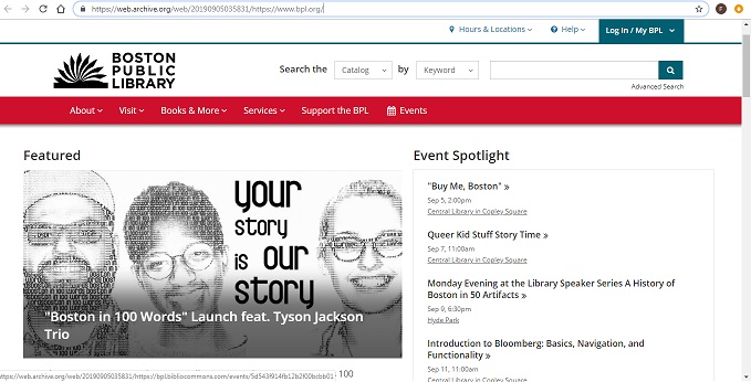
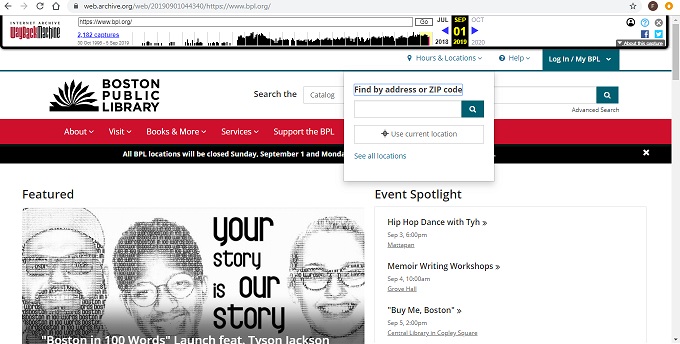
Boston Public Library’s website today is on a white background with blue and red task bars. The logo is a fanned out black book with “Boston Public Library” also in black. The most important and frequently asked questions are at the top of the page, like hours, searching the catalog, and events. Below the task bar/navigation bar is a featured event with a photo. To the right is a list up upcoming events in chronological order. Below that is browsing material if I were looking for a new book to read, or other online resources. At the very bottom left there are links to their social media pages: Facebook, twitter, Instagram, and YouTube. I think that the page is aesthetically pleasing and there isn’t too much information overwhelming me. The white background is a good choice.
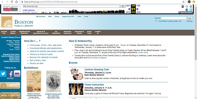
Upon opening the 2014 website, my first impression is that it seems dated and not pleasing to look at. The main colors are light blue, dark blue, tan, and grey on a white background. While I don’t like the look of it, I know I have seen current library websites that look similar to this. It is functional, with the most important quick facts at the top. The hours are written out on the left hand side of the screen and there is a list of handy frequently asked questions. It’s easy to locate events search the catalog. I like how “Electronic Resources” has its own tab on the main navigation bar. The logo is a fanned white book on a tan square background and BPL is written in dark blue. The 2014 page has more social media than 2019 and includes Facebook, twitter, Foursquare, LinkedIn, Flikr, YouTube, Pinterest, and Instagram.
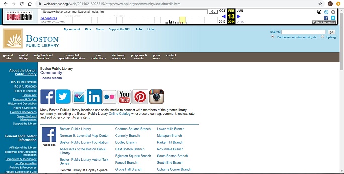
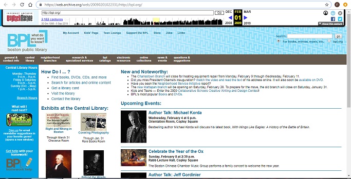
The 2009 website looks nearly identical to the 2014 page. It is mostly light blues and white and has some different quick links, but has the same layout and structure. The logo is just the letters “BPL”. There are no apparent links to any social media sites. On the left side of the screen under the hours is a link to an e-mail newsletter. It seems that the promotion of their newsletter in 2009 was replaced by 2014 with the links to their new social media pages.
The 2019 page looks more aesthetically pleasing and is more modern. There is more going on that can take the user farther and farther down the page. It is nice if I were browsing the site, and of course there is a navigation bar is at the top if I have something specific I’m looking for I don’t need to scroll at all. I do like the simplicity of 2009 and 2014, what you see is what you get, but the pages are ugly. The color scheme change really makes a difference, in 2019 to have dark blue and red on a white background makes the site look clean. I imagine that the web designer took out the list of hours to unclog the space. 2019 has more pictures and fewer words, while in 2009 and 2014 there is a lot of small text and potential reading covering the homepage.
- In 2009 and 2014 I can see the hours listed right away to the left of the screen on the front page. In 2019 there is an “Hours & Locations” button at the top right and when I click it, it prompts me to enter in my zip code, or click “See All Locations”.
- The color scheme changes from light blue and grey in 2009, to tan, light blue, and grey in 2014, to red and dark blue in 2019.
- There was no real logo in 2009, just the letters BPL. A logo has been created by 2014 of a fanned book and there is an updated version by 2019.
- The nearly identical websites from 2009 and 2014 are short and I can almost see the complete page at once, only taking a short scroll to reach the bottom. It has four sections in a 2x2 square: “How do I…?”, “News and Noteworthy”, “Exhibits at the Central Library”, and “Upcoming Events”. The 2019 website homepage has much more information on it and I have to keep scrolling about 4 times to get to the bottom. It has sections like “Featured”, “Events Spotlight”, “Books on Order”, “New in Fiction/Kids/Teens”, “Our Special Collections”, “Blog Posts”, “Online Resources”, “Recommended Reading”, and “New and Noteworthy”.
- There was no social media in 2009, 2014 had eight social media platforms, and in 2019 there are four.
- In the 2009 and 2014 website I can hover over a navigation bar option and a menu drops down with website destinations. In 2019, I have to click on a term to see the drop down menu.
Most Important Changes:
- General layout- Everything on one page in 2009 and 2014 -> A lengthy page with browsing tools/links in 2019
- Logo and color scheme change/upgrade
- Hours visible in 2009 and 2014 -> Selecting location to view hours in 2019
| Year | Aesthetic Feel | Navigation Options | Content |
|---|---|---|---|
| 2009 | Dated and bland. Light blues and grey. | “general & contact info”, “central library”, “neighborhood branches”, “research & specialized services”, "bpl catalogs", "electronic resources", "online collections", "news & events", "questions & suggestions". | “How do I…?”, “News and Noteworthy”, “Exhibits at the Central Library”, and “Upcoming Events” |
| 2014 | Nearly identical layout as in 2009. New logo is a welcomed addition. New color scheme is not appealing. Light blues and tan. | “general info”, “central library”, “neighborhood branches”, “research & specialized services”, "our collections", "electronic resources", "programs & events", "press room", "contact us". | “How do I…?”, “News & Noteworthy”, “Exhibitions”, and “Events”. |
| 2019 | Updated and modern feel. More aesthetically pleasing. Color scheme updated to red and dark blue. | "About", "Visit", "Books & More", "Services", "Support the BPL", and "Events" | “Featured”, “Events Spotlight”, “Books on Order”, “New in Fiction/Kids/Teens”, “Our Special Collections”, “Blog Posts”, “Online Resources”, “Recommended Reading”, and “New and Noteworthy”. |
Lab 1 Reflection
In the first lab I created my first HTML document on my notepad. I had never used my notepad before, so it was all new for me. It was a lot easier than it initially seemed! The HTML5 Tutorial from W3Schools was extremely helpful and everything was laid out step by step. I have coded headers and paragraphs in the past, but I learned how to create lists for the first time.
Lab 2 Reflection
This second lab was a bit more challenging. I had the most trouble adding images. I discovered that I had saved two index.html files on my computer and I was working in the wrong one. I must have clicked save as twice during the first lab! I found the other file and saved it alongside my images, and then deleted the other duplicate index.html file. Creating a table was easier than I expected and it was nice to end the lab on a positive note.